
In my years working with materials, I have been "fooled" by renderings several times, and each time it was quite expensive.
The most expensive one was the white wall. In the image it was a warm, soft matte white, with the texture faintly visible in the light. After completion it was indeed white, but standing two meters away, there was a net made of panel seams on the wall—completely invisible in the image.
It's not that the rendering was done wrong; it's that the "default settings" of the rendering have no joints.
There is an open secret in this line: renderings are for decision-making, not for construction. They prove that "this direction is feasible," but they do not promise that "it will look the same once installed on the wall."
The five deviations below are ones I have encountered repeatedly.
Deviation one: scale—there are no seams in the image
In renderings, the wall surface is usually a single continuous piece of material, with at most a line drawn at the corner.
For actual wall installation, panels have dimensions. The standard is 1.2 m wide and 2.4 m high; a 6 m wall therefore has 5 vertical seams; a 4.5 m floor height means 2 sections, with one additional horizontal seam.
These joints are almost invisible in high-gloss renderings because they are treated as "natural boundaries of the material." But in reality, joints are the first thing seen—especially on white, light-colored, and flat wall surfaces.
How to verify: Ask one question with the design drawing: "How large are the panels on this wall, and where are the joints?" If the other party cannot answer, the drawing is only a mood image.
Deviation two: light—the image shows "the best kind of light"
The default lighting in renders is "three-point lighting": soft key light, even fill light, and rim light for outlining. Under this kind of lighting, any material looks good.
Light in real spaces is like this: a spotlight is aimed slightly off, outside light is blocked by the building opposite, and the color temperature of the light strip is two steps lower than designed.
The same white appears warm white under 3000K wall-washing lights, gray-white under 4000K linear lights, and cool white under diffuse light from a skylight. Renderings will only give you one.
How to verify: Ask "Where is the light source in this drawing, what is the color temperature, and what is the illuminance?" If they cannot answer, the lighting was "felt" rather than designed.
Deviation three: color—screens and white balance are both deceiving you
This is the most hidden one.
Renderings are color-adjusted on the designer's monitor, compressed on export, and then white-balanced again by the system on your phone. After three rounds, the color is no longer the original color.
What is more troublesome is the "simultaneous contrast illusion": a beige piece looks cool next to a warm gray floor and warm next to a cool gray floor. The color in the image is "calculated" together with its surroundings.
How to verify: Do not determine color from images on a phone; look at a physical mock-up under the project's actual lighting. If images must be used for communication, have the designer place a standard gray card in the image as a reference.
Deviation four: cleanliness—images never show stains
The wall in the rendering is new, clean, and untouched.
Real walls: below the corridor chair rail, luggage carts will hit them; next to elevator hall buttons, there will be fingerprints; on walls next to the kitchen, there will be oil mist; on exterior walls, there will be rain marks by the third year.
These will not appear in the renderings, because what is rendered is "the day of delivery."
How to verify: When looking at the drawing, "add" things to it yourself — add luggage carts, handprints, rainwater. Think about whether the wall would still look acceptable in that state. This step requires no tools, only a bit of imagination.
Deviation five: junctions—the part most easily omitted in images
Internal corners, external corners, door frames, window sills, skirting and light coves—in renderings these places are usually simplified into a clean line.
Real finishing must handle four or five things: who overlaps whom, how much gap to leave, what trim piece to use, and where to apply adhesive. Each one will leave a mark on the finished product.
I suffered this loss on a project: the drawing showed a clean right angle at the external corner, but what was actually built was a corner cap, which protruded 3 mm beyond the panel and formed a clearly visible bright edge under side light. The client's first sentence upon seeing it was, "Why is there an extra line?"
How to verify: Have the designer produce three detail drawings (internal corner, external corner, opening). If they cannot, it means this version of the scheme is not yet at a constructible level.
Three things in the images that are truly credible
Having described five deviations, I must also make it clear: renderings are not useless. There are three things they are reliable for.
First, proportion. The panel's height-to-width ratio, the division proportion of joints, and how much of the facade the material occupies—these are geometry, and rendering will not change them. Looking at proportions is the most effective use.
Second, joint positions. If seams are drawn in the drawing (some careful designs do draw them), then the seam positions are the layout intent. This information is very valuable, more reliable than color.
Third, light and shadow direction. The light-and-dark relationships in the image suggest the direction of the light source. This direction determines which way the texture's relief leans; during actual installation, the lighting positions must follow it.
In one sentence:Look at the image for structure, look at the sample for color. Separate these two things, and renderings go from "deceptive things" to "useful tools."
Turning the rendering into a sample list
What I do now: when I get a set of design drawings, I don't judge whether they're good or bad first—I translate them into a checklist first.
The checklist has four columns: location, parameters to confirm, confirmation method, responsible person.
For example, for the row "entrance main wall": confirm panel width (see drawing), joint position (see drawing + layout drawing), color code (see physical sample), surface texture (see physical sample), and light spacing (see lighting layout drawing).
Fill it in row by row, and those "invisible things" on the drawing become "questions that must be answered."
Take this list and go through it with the design, construction and supply parties, and most of the "problems discovered only after installation" can be solved in advance.
Four sets of solutions, four ways of reading drawings
The four sets of schemes made recently correspond exactly to four key points for viewing images.
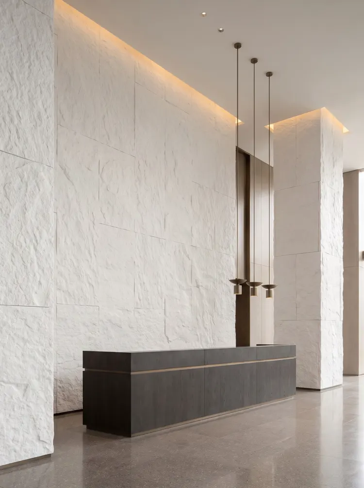
High-end hotel public areas(six groups of spaces): focusing on "how one material changes across different spaces." The key focus is on panel width and joint positions, because the differences among the six locations all lie in these two variables.
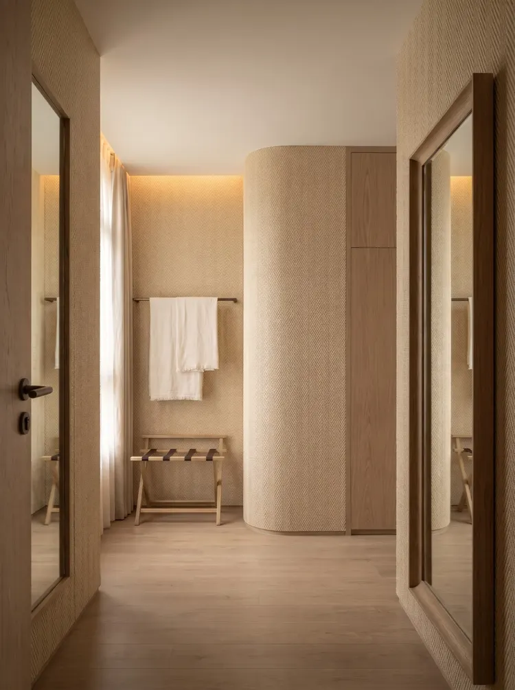
Hotel guest room floor corridor: What is being assessed is "continuity along the length." Focus on whether there is a horizontal joint—if a 2.8-meter floor height is installed horizontally, there will be a continuous horizontal joint, which is usually not drawn on the drawings.
Hotel guest rooms: What is being assessed is the "human scale." Focus on how the texture looks at a distance of 1 meter, and the occlusion relationship with openings and furniture.
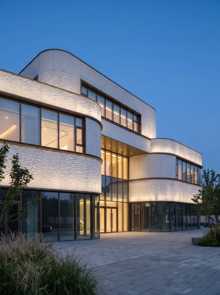
Art commercial center exterior wall: What is being assessed is "volume and shadow." Focus on the curvature of curved corners, the joint width between volumes, and the position of inter-story light coves.
The complete comparisons of the four sets of solutions are respectively inHotel public areas、Guest room floor corridors、Hotel guest rooms、Commercial center exterior wall, each article indicates which are design conditions and which are verifiable practices.
How to make sampling useful
After knowing that images are unreliable, many people go for samples. But sampling often ends up being wasted too.
Three situations for white application:
Make only a small panel. A sample of 10×10 centimeters cannot show the texture scale, and the reflected light at the edge makes it appear brighter than it actually is. At least 20×30 centimeters.
Look only under the light. Spotlights in a showroom are the most flattering light. Look at it under the project's actual lighting, or at least bring a sample to the site.
Make only one panel. With only one sample, batch differences cannot be seen. Make three panels from different batches of the same product and view them side by side; only then can you know "how good this material's stability is."
A useful mockup is "three pieces, on site, three time periods." Three pieces to check batches, on site to check light, and three time periods to check changes throughout the day. Once this set is completed, the position of the rendering is replaced by the physical object.
Three uncertainties about the material itself
Beyond the images, the material itself has uncertainties that never appear in renders.
Batch variation. Same model, different batch, slight differences in shade. Lighter colors show it more than dark colors. The solution is "same project, same batch number," and state this in the order.
Direction. Textured materials (wood grain, fabric grain, woven) have direction. The same panel used horizontally and vertically produces two different effects. Direction is usually not marked on drawings.
The feel of the joints. The misalignment between panels may not be visible to the naked eye, but it can definitely be felt with a finger. A 0.3 mm misalignment shows up as a line when light hits it. This is not shown in the drawings, but it is present during acceptance.
What these three things have in common is that they are not in the material parameter table; they all appear when the material is "in use."
If Party A provides only one image
This situation is very common: the client sends a picture from Pinterest and says, "I want exactly this feeling."
At this point, do not quote a price directly. Do three things first.
Step one, break down the drawing. In this drawing, which parts are materials, which are light, which are furniture, and which are later additions. Most of the time, half of the "premium feel" of the drawing comes from furniture and light.
Step two, translate. Translate "this feeling" into three executable choices: color tendency (warm/cool/neutral), texture coarseness (fine/medium/coarse), surface gloss (matte/slight sheen).
Step three, provide comparisons. Take back three renderings in different directions and let the client choose. Quote after the choice is made.
These three steps take two days and can save two months of rework later. I have seen too many projects get stuck on "being unable to clearly state what is wanted," rather than on "being unable to make it."
Who should pay for the deviations
To be honest: the deviations in renderings are ultimately usually paid for by the contractor and the supplier.
Because the contract says "construct according to the rendering," and the joints invisible in the drawing, the color differences invisible in the drawing, and the closures invisible in the drawing all become "you didn't do it well."
A healthy approach is to specify three things clearly in the contract: the physical sealed sample prevails, the layout drawing prevails, and the detail drawing prevails. Renderings serve only as a reference for "design intent" and not as acceptance criteria.
These three sentences are not complicated, but they need to be said before the contract is signed. If said afterward, they become shifting responsibility.
What will be missed when quoting from a single image
When someone gives you a rendering and asks for a quotation, the fastest approach is "area multiplied by unit price." A number quoted this way will most likely lose money.
At least four items are missing: shape loss (curved surfaces, column wrapping), openings and edge finishing (openings, light troughs, signage), substrate treatment (leveling, hollow repair), and finished product protection (protection between installation and handover).
Take a white wall as an example: on a drawing it looks like six large walls, but in actual construction there are 11 window openings, full-length light troughs, and 4 clad columns. These are "absent" on the drawing but "must-have" in the quotation.
My approach is to ask three questions first: what's the floor height, how many openings, and are there any curves. Once I have those three numbers, the estimate error drops from 30% to 10%.
A counterexample: treating renderings as acceptance standards
I have seen a project where, during acceptance, the client compared it with the rendering and said, "The image is pure white, but what you made looks gray."
The problem is in the drawing: the light in that rendering is 4000K, but the actual installation is 3000K. The same panel does look whiter under 4000K.
There was no winner in this argument. The client felt fooled, and the contractor felt wronged. In the end it was solved by "readjusting the lights"—switching to 4000K lamps made the wall "look white," but the atmosphere of the whole space also changed.
If you had asked "what color temperature is this light" when looking at the image, this would not have happened.
Closing remarks
Renderings are communication tools, not commitments.
It can answer "is this direction right", but cannot answer "will it look like this when made". The latter question can only be answered by physical samples, layout drawings and node details.
So now when I look at a design, I'm in the habit of asking three questions first: how big are the panels, where are the seams, how warm is the light. Once those three are answered, the drawing is "viewable."
See the actual product and specifications of white star-moon stone atProduct page 169; for comparison of linen texture and woven textures seeCloth Texture and Weave Series: ; for the sample-making and sample-sealing process, seeSelection Guidesin the relevant sections.
Related articles
Three enemies of the white exterior wall: rain marks, alkali scaling, and seam dirt
White exterior walls look good on delivery day; the difference shows in the t...
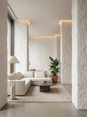
How can one white color used across six spaces avoid looking perfunctory?
A white Star Moon Stone used across six spaces in a hotel public area can eas...
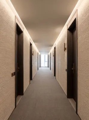
Cloth texture, coarse cloth texture, hemp weave: how to choose among three kinds of "fabric-feel" wall surfaces comes down to the same thing
For the three fabric-feel textures—cloth texture stone, coarse cloth texture ...
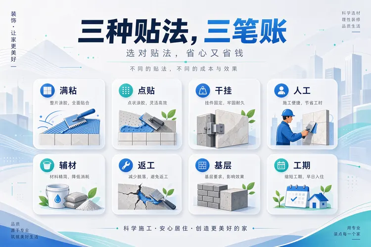
满粘、点贴、龙骨干挂:三种贴法的人工、辅材与返工概率
同一块 3 mm 的板,满粘、点贴、龙骨干挂三种做法,人工能差一倍,辅材能差一半,返工概率差别更大。差别不在"粘不粘得住",在三个地方:胶的覆盖面积、板背...