
The client often says one thing: I just want this kind of white, use it throughout, unified.
Unification is correct. The problem lies in "using it everywhere"—the same color code, the same specification, and the same installation method covering six spaces, so walking through feels like going in circles in one room. Guests cannot remember it, and designers themselves will feel it is perfunctory.
True consistency is "the same material with four variables differing." These four variables are: panel width, seam position, light, and surrounding materials. The material stays the same; the visual impression changes.
This article uses a set of six-space schemes (entrance, reception, lounge area, elevator lobby, lobby bar, curved feature wall) for point-by-point comparison, breaking down these four variables.
Variable 1: Panel width, which determines whether this wall "looks expensive"
The same material, using 1.2-meter-wide panels versus 0.6-meter-wide panels, gives two different feelings.
Wide panels have fewer seams, look more unified, and cost more; narrow panels have more seams, look more fragmented, and cost less. This is a very direct conversion: a 6-meter-wide wall has 5 seams with 1.2-meter panels and 9 seams with 0.6-meter panels.
The usage in the plan is: use wide panels (1.2 meters) at the entrance and reception, because these two places are the "first impression"; use narrow panels (0.6 meters) in the lobby bar, because the viewing distance there is more than 2.5 meters and the seams are not visible, so the money saved can be spent elsewhere.
This is the core logic of "variable one":Panel width follows viewing distance, not area.
Variable 2: Seam position, which determines whether this wall "has order"
The width of the joint is not up to you; the position is.
In the same space, joints can be arranged in three ways:
- Equal division: looks orderly, but the joints are evenly distributed, so none stands out
- Centered: lay out from the centerline to both sides, with a full panel always at the center
- Align with furniture: place joints at "objects" such as door frames, cabinets and bedside tables, where they are blocked
Three methods are used in the plan: centered at the reception desk (a full panel in the center, symmetrical on both sides), aligned with the door casing in the elevator hall (the seam is absorbed by the door casing), and equally divided in the rest area (large area, equal division saves the most material).
The three arrangements have no advantages or disadvantages, only "how this wall will be viewed." The front desk faces people directly and must be centered; the elevator lobby is viewed while walking diagonally, so aligning with the door frame is enough.
Variable 3: Light, which determines whether this wall "is a blank white board"
The biggest problem with white is that it easily becomes "a white without detail," especially under even lighting.
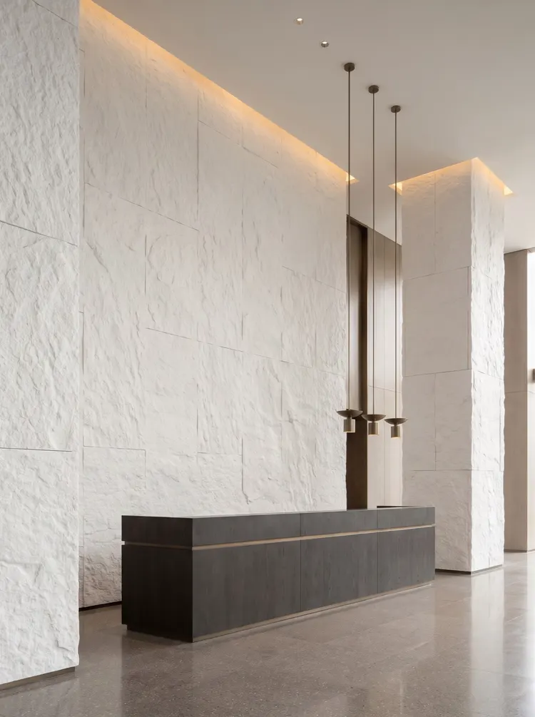
For the same wall, with the light 300 mm from the wall, the texture's undulations are swept into shadows by the angled light, and the white has content; with the light 1.5 m from the wall, the light is even, and the white becomes flat.
The method in the plan is to set light spacing by space:
- Entrance: wall-washing lights 400 mm from the wall, light angled down from above to outline the curve of the door opening
- Front desk: three pendant lights + top wall washing, lights 600 mm from the wall, light pools falling on the reception desk, with the wall as backdrop
- Elevator lobby: light slot 300 mm from the wall, the closest light distance, the most obvious texture
- Lobby bar: lights at least 1.2 meters from the wall, even lighting, letting the wall recede
The same color code, four lighting distances, four different visual impressions. This is the variable most easily overlooked with white.
Variable 4: Surrounding materials, which determine the "temperature" of the white
White is not absolute. It reflects surrounding colors and borrows the surrounding warmth.
In the plan, the floor is warm gray-beige terrazzo, the furniture is smoked dark oak and off-white fabric, and the metal is a small amount of antique bronze. These three determine that White Star Moon Stone leans warm in this set of spaces.
If switched to cold gray polished tiles + stainless steel + white walls, the same material will appear greenish, cold, and cheap—not because the material has changed, but because the reflections have changed.
This is the point most easily skipped during material selection. When looking at samples, people stare only at one panel and not at the floor, furniture or metal beside it. The correct approach is to look at surrounding materials together, even if it is just a few photos placed side by side.
Entrance: the task of this wall is to "recede"
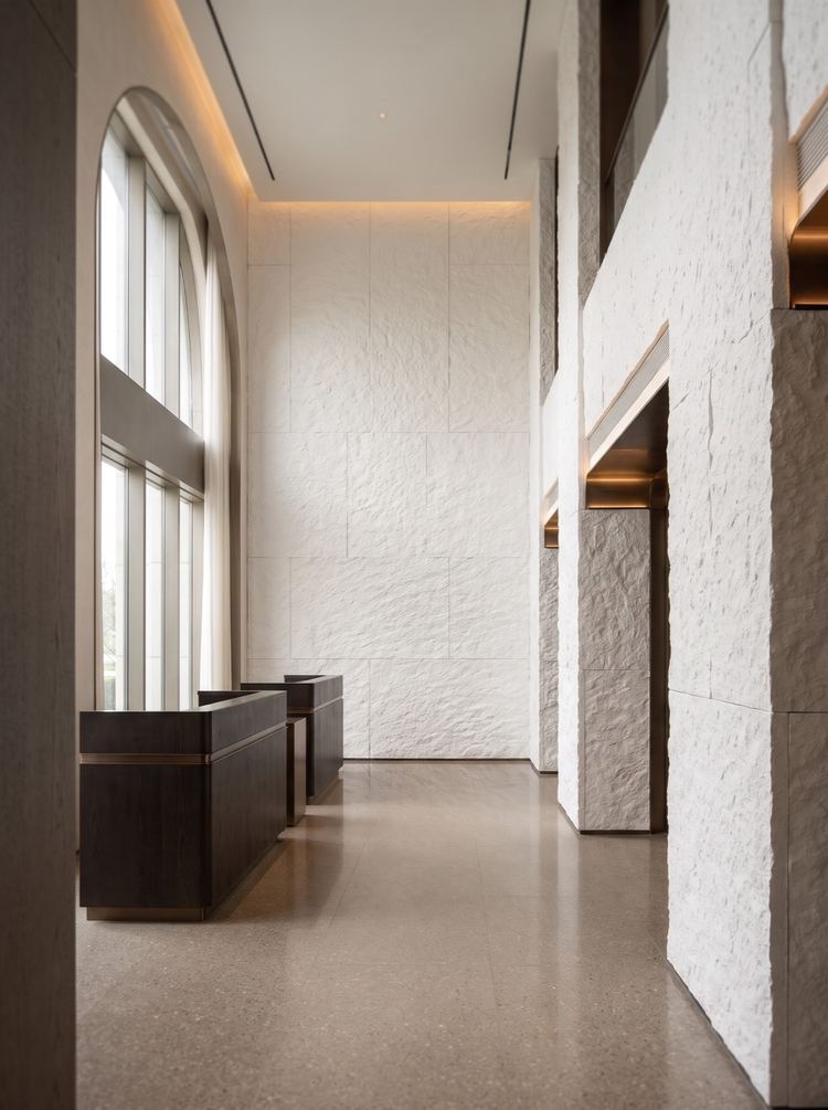
The entrance wall does not need to be remembered; it needs to be "passed through."
So this spot uses the most understated expression: standard texture, wide panels, seams falling on both sides of the door opening, no added profiling. The first thing people see when they enter is the light and the reception desk; the wall is their backdrop.
If the entrance wall is made too "full," the subsequent spaces cannot progress. This is a basic skill of circulation design: the first place should be left blank.
Front desk: the task of this wall is to "stand"
The front desk is the only place in a hotel where "a person faces the wall directly and stays for more than 30 seconds." The wall here needs a sense of order.
In the plan, with a 4.5-meter floor height and 2.4-meter panels, two segments are inevitable. The horizontal seam is placed at 2.4 meters, exactly 1.3 meters above the reception desk — invisible when standing, and not at the center of the line of sight when seated.
Vertical seams divided evenly at 0.6 m, but laid out from the central axis to both sides, ensuring a full panel in the center. Column cladding uses same-color L-shaped corner trim; the front of the column is a single piece without joints.
Rest area: the task of this wall is "warmth"
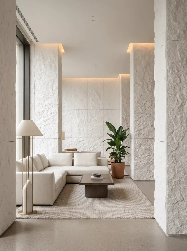
The rest area is by the window, with sunlight slanting in. This section of wall is the most "alive" because the light keeps changing.
No special treatment is made for this section in the plan — the same panel, the same seam spacing. Its variation comes from light: flat in the morning, angled in the afternoon, warm in the evening.
This also illustrates a principle: places where variation is possible do not necessarily all need to be done with materials. Sometimes leaving space for light is more sophisticated than adding forms.
Elevator lobby: the task of this wall is "closeness"
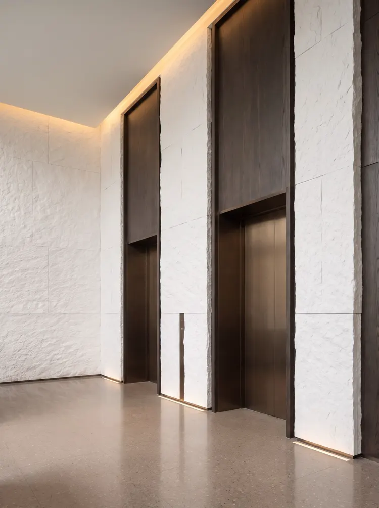
The elevator lobby has the closest viewing distance of the six locations, within 1 meter. When viewed up close, the number of seams matters more than the width of the seams.
The method in the plan is "two panels to the edge": one wall uses only two 1.2-meter-wide panels, with only one seam, placed next to the elevator door casing. The light trough is 300 mm from the wall, the closest of the six locations.
Lobby bar: the task of this wall is to "yield"
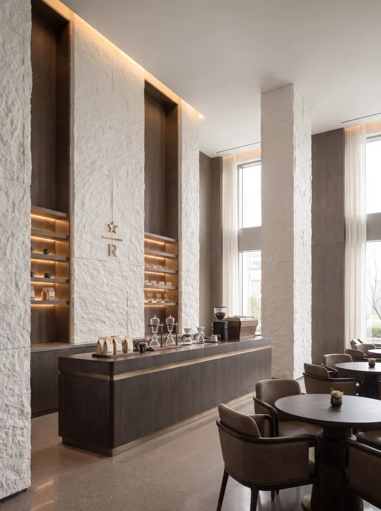
In front of the lobby bar there are the bar counter, wine rack, pendant lights and people. The wall should yield.
The plan uses 0.6-meter narrow panels, 1.2-meter equal division seams, and even light. Together, these three make the wall "flat," and people sitting at the bar will not notice it.
End view: the task of this wall is to "turn"
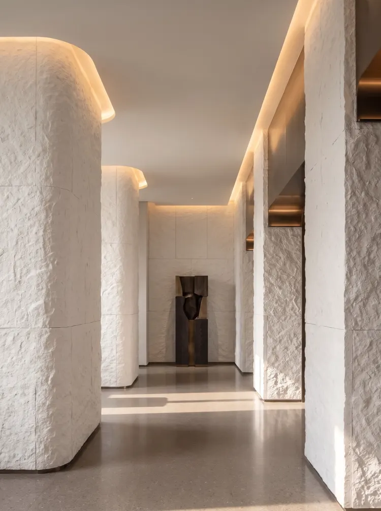
The curved end feature at the end of the corridor is the only place using a curved surface.
On curved surfaces, seams follow the arc, not radial lines. Because the texture is flaky and undulating with an inherently irregular direction, diagonal seams would clash with the texture; following the arc turns the seam into a horizontal guiding line.
The radius here is about 800 mm; the whole piece is bent and bonded, with no narrow strips pieced together.
Prerequisite: same batch number before same color number
IV. For the four variables to hold, there is one prerequisite: the panels in the six spaces must be from the same batch number.
White is particularly sensitive to batch numbers. For the same panel, a half-shade difference between two batches becomes a dividing line on a white wall. And a white wall has no other color to "borrow"—dark walls have texture and shadow to help conceal things, but a white wall hides nothing.
So for this type of project, the order must state: "same batch number for the entire space, no color switching allowed." If two batches really do arrive, there is only one way to handle it: use panels from different batches in different spaces, and do not mix them on the same wall.
This may sound trivial, but it's the first threshold for whether "one white can work across six spaces" holds up. If batch numbers aren't consistent, the four variables that follow are all for nothing.
Internal and external corners: white closures have nowhere to hide
If the closing details of a dark wall are done poorly, shadows can still help hide it. White walls cannot.
The methods for the three termination details in the plan are fixed:
Internal corner: Two panels are joined with a 0.3mm gap, without filling with adhesive. The joint in white-on-white is almost invisible; filling it with adhesive would instead create a line of a different color.
External corner: Use same-color L-shaped corner trim pieces, wrapping over 20 mm. White corner trim must match the panel's color code exactly; even a slight difference creates a line of a different color, which looks worse than no trim at all.
Column corner: Use corner closing pieces at all four corners of square columns, with the column face as a single piece without splicing. For round columns, divide into strips according to circumference and place the seams on the backlit side.
If these three places are not done properly, the "premium feel" of the six spaces will leak away starting from the corners. When people look at a wall, their eyes unconsciously seek the edges—if the edges are not clean, the whole wall loses value.
If the budget is only enough for three spaces
Doing all six spaces in the same style is not cheap. When the budget is tight, I suggest prioritizing by "how long people linger."
First priority: reception desk. People stand here for more than 30 seconds, looking directly at the wall. Second priority: elevator lobby. People wait for the elevator for an average of 40 seconds, within 1 meter. Third priority: entrance. People pass by for 5 seconds, but this is the first impression.
The lobby bar and lounge area can be placed later—the walls in those two places are backgrounds and can be replaced with budget-friendly solutions (such as same-color latex paint + partial panels). People sit there with their attention on the people and things on the table, not on the wall.
This ordering is not an excuse to save money; it is "spending money where people can see it."
There is also an unwritten variable: who does the work
If the six spaces are divided among three crews, the results will definitely not be consistent.
It's not because the craftsmanship is poor, but because habits differ: some people are used to laying out from the middle to both sides, some from left to right; some apply thin adhesive, some apply thick adhesive; some use a 6 mm notched trowel, some use 8 mm.
White walls amplify all these differences. On the same wall, a little extra adhesive thickness creates a dark shadow when light hits it; a joint half a millimeter wider makes the entire line crooked.
So the approach for this type of project is: one set of briefings, one crew, one workflow. First build a sample section (usually the elevator lobby, which is small in area and exposes problems quickly), and after acceptance, replicate it to other spaces.
This step costs nothing, but it's more effective than any material upgrade.
IV. Four variables, one combination table
| Space | Panel width | Joint position | Distance of light from wall | Surrounding main materials | The task of this wall |
|---|---|---|---|---|---|
| Entrance | 1.2 m | Set on both sides of the door opening | 400 mm | Dark wood reception desk | Recede |
| Reception desk | 1.2 m | Centered, full panel at the center | 600 mm | Dark reception desk | Vertical |
| Rest area | 1.2 m | Equal division | Mixed (daylight) | Off-white fabric, wood | Warm |
| Elevator lobby | 1.2 m (two pieces to the edge) | Align with the door frame | 300 mm | Metal elevator door | Near |
| Lobby bar | 0.6 m | 1.2 m equal spacing | 1200 mm | Wine rack, pendant lights | Let |
| Curved end feature | 1.2 m | Follow the curve | 350 mm | Wood end-view console | Turn |
This table can be taken directly to a meeting. Six spaces, four variables, six tasks, and what comes out in the end is a set rather than a single room.
A failed approach
I have seen a project where all six spaces used the same white, the same specification, the same equal seams, and the same light spacing.
The first impression on walking in is "clean," the second is "empty," and the third is "did they run out of money for design?"
The problem is not the material; it is that the designer did not set a "task" for each space. If every wall has the same task, the result will be the same.
White is the color that most tests "proportion." It leaves no room for shaping, so differences can only be created through four variables: panel width, joint position, light, and surroundings. None of these four variables cost money, or cost very little, but they determine whether the space "has been thought through."
In the end, unification is not about covering everything with the same thing, but about letting each thing be in its proper place.
Material file
White star-moon stone belongs to the "art and three-dimensional texture" series of flexible stone, neutral white, matte, with a surface of dense irregular shallow relief and flake-like undulations, regular thickness 2.5–3.5 mm, and can be bent and applied in whole sheets.
For actual product and color patterns, seeWhite star-moon stone product page; the sheet-by-sheet comparison of the six groups of spaces is inHigh-end hotel public area scheme; for the selection criteria of panel width and specifications, seeFlexible stone series.
Related articles
Cloth texture, coarse cloth texture, hemp weave: how to choose among three kinds of "fabric-feel" wall surfaces comes down to the same thing
For the three fabric-feel textures—cloth texture stone, coarse cloth texture ...
What lights should be used with flexible stone? Color temperature, color rendering index and wall-washing light mock-ups
Why does flexible stone look like it has changed color when you change a lamp...
Three enemies of the white exterior wall: rain marks, alkali scaling, and seam dirt
White exterior walls look good on delivery day; the difference shows in the t...
How much can you trust a rendering: five deviations from design drawing to installed wall
Renderings are getting more and more realistic, but the five deviations betwe...