
For that Xi'an hotel, four spaces—lobby, guest rooms, corridors, restaurant—use the same color number and the same batch of panels.
During acceptance, the client said one thing: "Why is the color different in every place?"
The panels are the same. The light is different.
This matter has come up repeatedly in projects I have done. When choosing materials, everyone stares at the color cards; during construction, everyone stares at the joints; few people stare at the lights. But what ultimately determines "what color this wall looks like" is often the lighting.
1. Four parameters that rewrite the color of a stone
Color temperature: one number changes an entire space
Color temperature is expressed in K. The smaller the number, the warmer; the larger, the cooler.
- 2700K: warm yellow, like incandescent light, commonly used in hotel rooms
- 3000K: Warm white, the most common commercial space color temperature
- 3500K: neutral, commonly used in office spaces
- 4000K: Cool white, commonly used in shopping malls and exhibition halls
- Above 5000K: Close to daylight, rarely used on indoor walls
The same beige board looks warm apricot under 2700K and gray-beige under 4000K. The difference is not slight; it is to the degree of "is this the same material?"
For that Xi'an project, the lobby uses 3000K spotlights, the guest rooms use 2700K table lamps, the corridors use 4000K linear lights, and the restaurant uses 2700K pendant lights. Four kinds of light, four colors.
So after that acceptance inspection, I proposed an approach:Color must be determined under the final lighting. If the lights have not yet been installed, simulate them with temporary lighting, and both color temperature and illuminance must match.
Illuminance: the relationship between brightness and distance
Illuminance is expressed in lx (lux). Common values for commercial spaces:
- Hotel guest rooms: 100–100 lx
- Hotel lobby: 200–300 lx
- Mall passage: 300–500 lx
- Showroom accent lighting: 500–1000 lx
If illuminance is insufficient, the wall surface looks dull and the texture cannot be seen; if illuminance is too high, light-colored panels will appear washed out and dark-colored panels will reflect light.
There is an even more practical question: how far the light should be from the wall.
Within 600 mm of the wall, the light produces a clear "wall-washing" effect, bright at the top and dark at the bottom, or bright in the middle and dark at the sides. At 1.5 m or more from the wall, the light is even and no light-dark layering is visible on the wall.
This distance determines whether the wall "has drama." If you want layering, bring the light closer; if you want cleanliness, move the light farther away. This decision should be made before layout, because light positions affect seam positions.
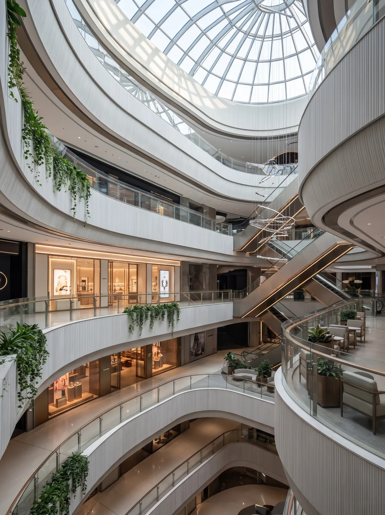
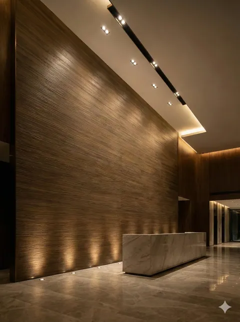
These photos are suitable for comparing how top lighting, parapet edge light and low grazing light at the wall base change the look, but they do not provide on-site illuminance meter readings, luminaire spectra or shooting white balance. Do not directly convert the warm appearance of the photos into a specific color temperature. When choosing lamps, still keep the same sample board in the same position, test the lamps, dim and observe in sequence, and control the comparison conditions first before discussing whether the material color has been changed.
Color rendering index: why some light makes walls look gray
The color rendering index CRI (Ra) indicates a light source's ability to restore the true colors of objects, with a maximum score of 100.
Ra 80 is the level of general commercial lighting. Above Ra 90, color reproduction is significantly better.
For stone, the impact of CRI is mainly reflected in "whether warm colors turn gray". Low-color-rendering warm light will make colors such as beige and wood grain look dirty; high-color-rendering warm light makes colors look clear.
So now when I give clients lighting requirements, I write only two: color temperature 3000K, Ra ≥ 90. These two are more specific than "use good lights" and more effective than specifying a brand.
When the budget is tight, you can use good lighting only on one main feature wall and ordinary lighting elsewhere. The human eye automatically focuses on the brightest place; if the main feature wall is right, the overall impression is right.
Light position angle: angled lighting and direct lighting are two different things
The same light, at different angles, makes the wall completely different.
Front lighting (perpendicular to the wall). Light shines straight down: the texture's undulations cast almost no shadow, and the wall looks flat. Suitable for spaces with high flatness requirements, such as minimalist office reception desks.
Diagonal lighting (30 to 45 degrees). Light grazes across the surface: the raised texture is bright and the recesses are dark, bringing out the layers. This is the most common approach for stone wall surfaces.
Grazing angle (10 to 20 degrees). The light travels almost grazing the wall surface, stretching the texture to its longest and deepening the shadows. Suitable for coarse textures, such as rammed earth and rough-faced granite. On walls with poor flatness, grazing light will expose every flaw.
This parameter is most easily overlooked when adjusting lights on site. Installers usually adjust with the goal of "illuminating" and do not consider texture. Therefore someone must be assigned specifically to adjust the angles, one light at a time.
II. Two kinds of light: daylight and light troughs
Skylight: the most difficult uniform light
That Guiyang commercial atrium, 2100 square meters, five stories high, with a grid glass skylight on top.
This kind of light is the most comfortable, and also the most unforgiving.
It feels comfortable because it is uniform. With no side light, no shadows, and no layering created by light strips, the wall brightness across the entire atrium is consistent and looks clean.
It is cruel because it gives you no cover. Under daytime diffuse light, the flatness of the wall, the straightness of the joints, and the color difference are all exposed.
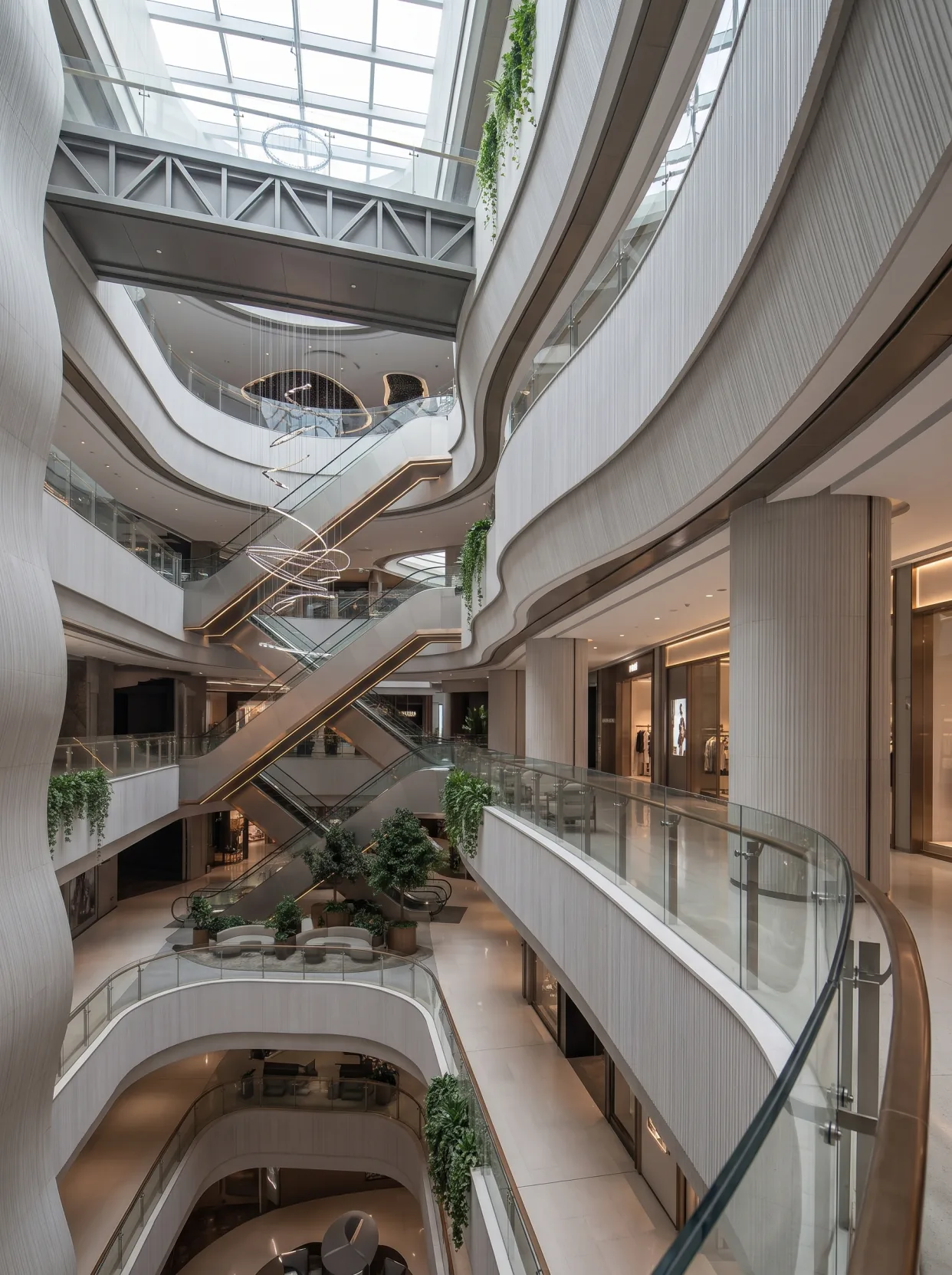
The atrium in this project has a closed perimeter of about 180 meters, with five floors of balustrades. The start and end must meet, and errors must not accumulate. Under uniform skylight, any misalignment can be seen.
So the layout for this project was not done "wall by wall," but "in a loop." Starting from the starting point, going all the way around back to the starting point, the width of the last panel was worked out backwards.
This kind of situation can be glossed over under ordinary lighting, but not under daylight.
Light trough: hide the light
The light groove is the most commonly used concealed lighting method. A groove is left along the lower edge of the panel, the light strip is concealed inside, and the light washes downward.
There are three key points for making light troughs:
First, groove width. 60 mm is the lower limit; if it is too narrow, the light will not come out and individual lamp beads will be visible. 80 to 100 mm is more reliable.
Second, the groove depth. The light strip must be at least 50 mm away from the panel surface; otherwise there will be a bright edge on the panel surface.
The third is the spacing of the light strips. LED strips with 60 beads per meter and 120 beads per meter differ greatly in effect. The 60-bead version will have "dots"; only the 120-bead version forms a continuous line.
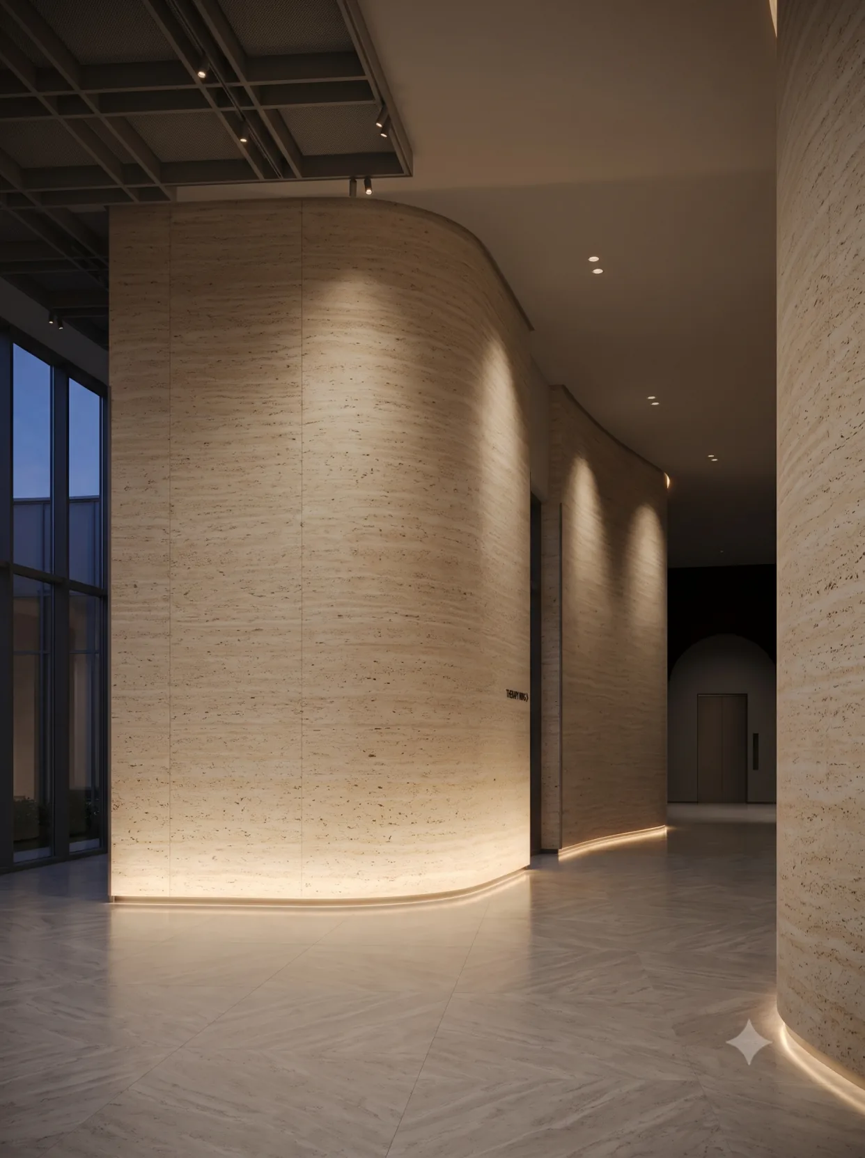
The approach in that tea room in Chengdu is more refined. Along the top of the wall is a contour light that follows the curve of the wall and outlines it. This light is not for illumination; it is for "drawing a line."
The difficulty in making this kind of contour light is that the light trough must follow the curve, and the curve is set out on site, not a standard component. Therefore, the width of the light trough will vary slightly, and when the light strip is installed, the uniformity of light will be affected.
The solution is to use flexible light strips (the bendable kind) and make the light groove at least 20 mm wider than the light strip to leave room for adjustment.
3. Four appearances within a single day
A day in the tea room: four looks
That Chinese-style tea room in Qingyang District, Chengdu, 320 square meters, has rammed earth panels on the walls with a horizontal strip texture. The designer made one request: "When guests sit down, they should not feel that the wall is flat."
Translated into lighting language, this sentence means three things: the texture must have direction, the joint lines must be concealable, and the flatness must withstand side light.
During the day, light comes in through the floor-to-ceiling windows and sweeps obliquely across the wall; the ridges and valleys of the strip texture cast long shadows, and the wall looks like real rammed earth.
At four in the afternoon, the sun is in the west, the light becomes horizontal, the grazing angle is very small, and the shadows of the texture are deepest. This is when the wall looks best.
At dusk, when daylight fades and the interior lights are not yet on, the wall becomes a uniform warm gray.
At night, with only the contour lights on the wall top and the small lamps on the table on, the wall recedes into the background and people become the protagonist.
The same tea room, the same wall, four different looks in one day. This is not the material's doing; it is the light's doing. I later told the designer, you are not actually designing a wall, you are designing four moments in a day.
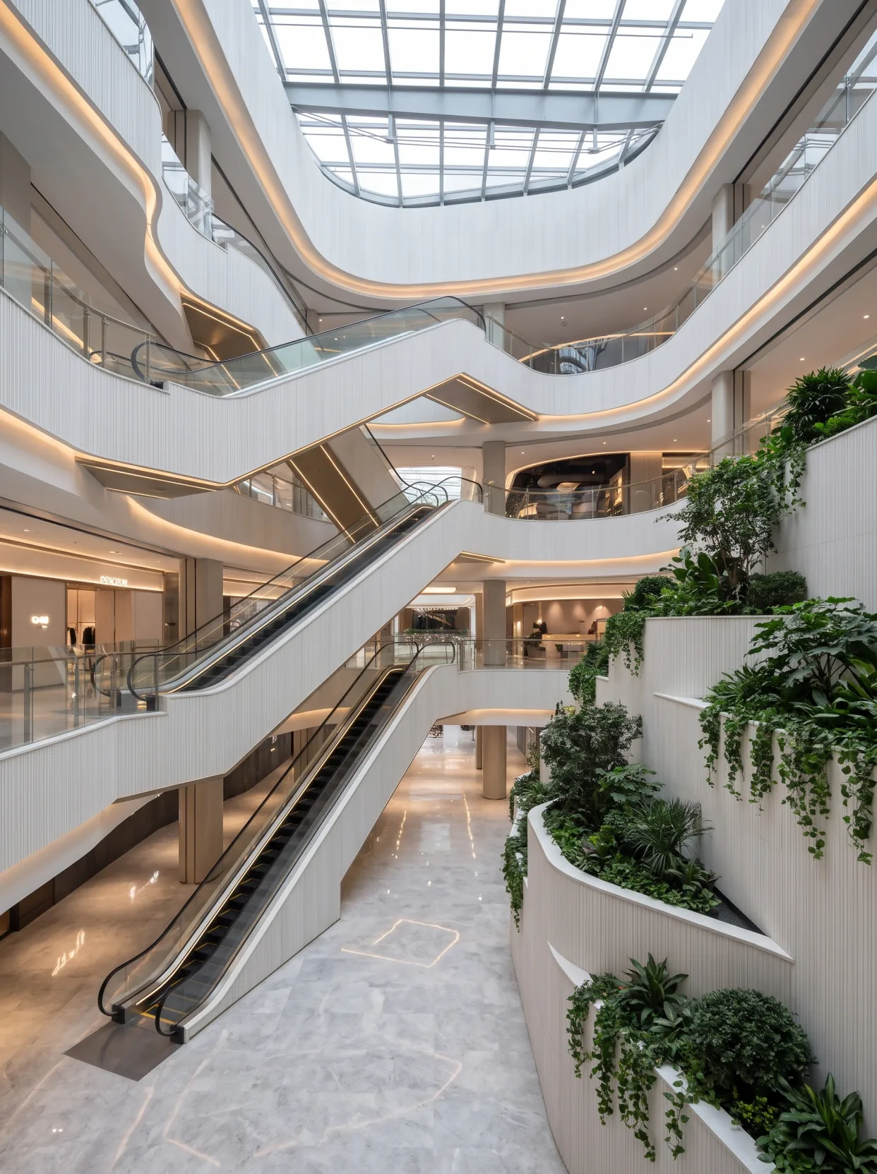
A beige panel under five kinds of light
Run through the five common lighting types and see what the same piece of beige travertine turns into.
| Light source | Color temperature | Ra | Wall presentation | Suitable spaces |
|---|---|---|---|---|
| Incandescent lamp / halogen | 2700K | 100 | Warm apricot, soft texture, looks best | Guest room headboards, restaurants |
| Conventional LED spotlight | 3000K | 80 | Warm white, slightly dull | Corridor, transition area |
| High color rendering LED spotlight | 3000K | 95 | Warm white and transparent, close to halogen | Lobby main feature wall |
| Linear light | 4000K | 85 | Gray beige, with clear texture but on the cool side | Office, shopping mall passage |
| Diffused daylight under the skylight | 5500–6500K | 100 | Cool white, colors flattened out | Atrium, double-height hall |
The most useful column in this table is "Wall presentation." When the client chooses materials, they see the color card, but what they actually see is the fifth column in this table.
If the same material spans three color temperatures in the same space, it will end up like that project in Xi'an, where the colors on all four sides are wrong.
Lighting makes walls look old
Few people mention this, but it does exist.
UV and heat will cause the material surface to change slowly. Light-colored panels will turn slightly yellow, and dark-colored panels will turn slightly gray. This change is gradual; it cannot be seen in one year, but it can be seen in three years.
What matters more is non-uniformity. Where the light reaches, it changes quickly; in corners the light does not reach, it changes slowly. After three years, a "light-spot-shaped color difference" will appear on one wall.
There are two ways to reduce this problem: first, choose luminaires with low UV output; second, distribute the light positions evenly and avoid illuminating only one area for long periods.
There is another special situation in commercial spaces: spotlights in display windows and exhibition areas stay on year-round, and the wall directly below will noticeably lighten within three years. If the lights are removed from this position later, the color difference will become apparent.
So during layout, I ask "which locations get long-term strong light." For those locations, I try to use the slightly darker panels from the same batch, leaving a little margin for future change.
IV. Test lighting: three times, solving one problem each time
Trial lighting: three times, solving one problem each time
Now when I work on a project, we test the lighting at least three times.
The first time, try during the day. Turn off all artificial light and look only at daylight. At this point you are judging how the material itself performs under natural light, as well as the flatness of the wall.
Second, try it in the evening. When skylight is dimming and artificial light has just been turned on. This is the most complex moment of "mixed light," and color temperature conflicts are most obvious. Warm spotlight and cool skylight mix together, and the wall will show an indescribable color.
The third time, try at night. All black, artificial light only. This is when color temperature, illuminance, angle and color rendering are assessed.
After three tests, basically all usage scenarios can be covered. Projects that test only once often miss the ugliest moment.
A failed lighting design
There was a project where the wall was finished and the client was very satisfied. Then the lights were turned on, and the client went silent.
Reason: a 4000K linear light is used, installed close to the top of the wall, only 200 mm from the wall. The light washes down vertically, the lower half of the wall is bright and the upper half is dark, forming an obvious dividing line. That dividing line is exactly at 1.6 m high; when a person stands in front of the wall, the face is in the dark and the wall is in the light.
This problem is not the material's fault; it is the light position's fault. The fix is to move the light 800 millimeters toward the center of the ceiling so the light spreads out. After the fix, the dividing line disappears, but the wall's layering is gone too.
Later I summed it up: wall-mounted lights should either be wall-washing (300 to 600 from the wall) or ambient light (more than 1.5 meters from the wall). The distance in between is the most awkward and will form a "line of light."
V. Three sentences for communicating with designers
Three sentences for communicating with designers
When it comes to lighting, the material supplier does not carry much weight. But I say these three sentences every time:
First sentence:Please give me the final lighting layout and color temperature. Without these two, I cannot determine the color.
Second sentence:For the main feature wall lights, can Ra reach 90 or above? This is especially important for warm colors and wood grains.
Third sentence:How far should the light be from the wall? This figure determines how I lay out the panels.
After asking three questions, many problems can be avoided at the drawing stage.
Finally
The material determines the wall's "base"; light determines the wall's "expression."
Spending two weeks choosing materials and two days choosing lights is the industry norm. But what people ultimately remember is often the light.
So now when I look at a project, I look at the lighting first, then the wall. Get the lighting right, and ordinary materials can shine; get it wrong, and even expensive materials are wasted.
To see the real product without lighting embellishment, Flexible stone series page has two sets of on-site photos under natural light and indoor light; the complete records of these two projects are in Guiyang Guanshanhu commercial atrium case and Chengdu Qingyang District Chinese-style tea room case.
Related articles
What to do if flexible stone gets dirty or damaged—cleaning, repair and panel replacement
How to clean flexible stone walls, and can impact damage and defects be local...
How to leave joints for flexible stone in dry regions? Heating-season construction and joint treatment
How should joints be left for flexible stone during the northern heating seas...
Cloth texture, coarse cloth texture, hemp weave: how to choose among three kinds of "fabric-feel" wall surfaces comes down to the same thing
For the three fabric-feel textures—cloth texture stone, coarse cloth texture ...
How can one white color used across six spaces avoid looking perfunctory?
A white Star Moon Stone used across six spaces in a hotel public area can eas...