
There is a type of wall requirement in renovation that is vaguely stated: wanting a bit of a fabric feel.
Only when you actually take a color card to choose do you discover that the "fabric feel" has at least three types: fine horizontal stripes like plain-weave cotton, coarser ones like linen, and another diagonal herringbone weave like a sweater. What the client describes is often a curtain or a jacket at home, and it must first be translated into material language.
These three look about the same on a sample board, but differ greatly once installed on the wall. The difference is not in "whether it looks like fabric," but in three places: viewing distance, texture direction, and how the seams run.
This article compares two schemes—beige cloth-grain stone for the hotel guest room floor corridor, and beige hemp-woven soft stone for the hotel guest rooms, with coarse cloth grain in between as a reference.
First look at a table: what are the differences among the three textures
| Comparison item | Cloth texture stone | Coarse cloth texture | Linen weave flexible stone |
|---|---|---|---|
| Texture form | Fine continuous horizontal ripples, about 1 mm per line | Horizontal ripples are coarser and the undulations deeper | Herringbone weave, diagonal crossing |
| Distant appearance | A textured light color where the pattern is almost invisible | A "pattern" can be seen, with a slight banding effect | The weaving direction can be seen, with a patterned feel |
| Close-up appearance | Fine parallel lines, soft edges | Distinct undulations, rises and falls can be felt by hand | The weave intersections are clear, like fabric |
| Requirements for the substrate | High, 2 m straightedge gap ≤2 mm | Medium, ≤3 mm | Medium, ≤3 mm |
| Texture direction | Must be level | Must be level | Diagonal, can be rotated 90 degrees to form two directions |
| What is feared most | Wall surface undulations will appear as "water ripples" | Strong side light amplifies relief | Large areas in the same direction create a diagonal oppressive feel |
| Recommended scenarios | Guest room floor corridors, elevator lobbies, guest rooms | Facade, feature wall, partial shaping | Guest room headboards, end feature walls, small-area focal walls |
The most useful part of this table is the "What it fears most" column. The problems of the three textures are all different; before choosing, first see whether your own site will make that mistake.
Cloth texture stone: wins by "having no visible pattern from a distance"
Guest room floor corridors are the most suitable scenario for fabric-texture stone.
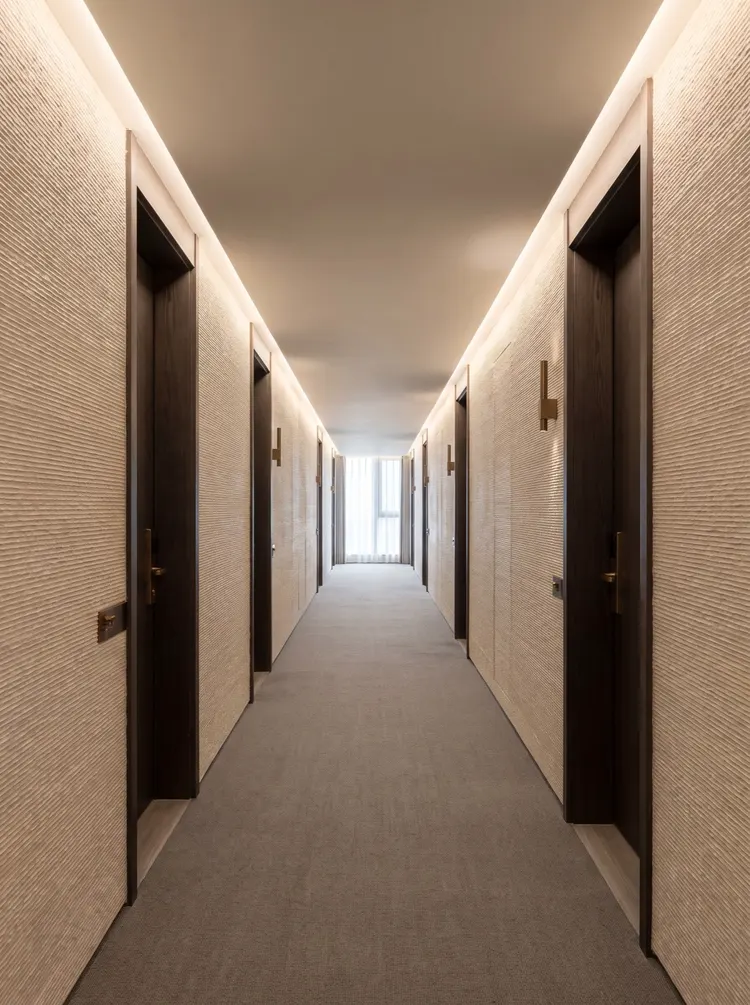
A corridor is a long line; people walk from one end to the other, past more than twenty doors. In this kind of space, the walls must not "compete," otherwise a single walk feels like flipping through wallpaper.
The fine horizontal grain of cloth texture stone is just right: from three meters away it looks like a clean expanse of beige, and only when you get closer do you discover the texture. Its presence is "given when you approach," not "striking at first glance."
But woven-texture stone has one hard requirement: the substrate must be flat. Because the texture is continuous fine lines, if the wall has 3 mm of undulation, each line will tilt accordingly, and the whole wall will look like cloth that has been pulled wrinkled. For spaces such as corridors, the substrate should be controlled so that the gap under a 2-meter straightedge does not exceed 2 mm, which is stricter than the conventional 3 mm.
There is another easily overlooked point: horizontal grain will be cut off at the door casing. The solution is to make the door casing wider—a 60 mm dark door casing line can "frame" the cut end, making it look as if the grain deliberately tucks in.
Coarse cloth texture: used where it "needs to be seen"
The corrugation of coarse cloth texture is coarser and the relief deeper, so it is "louder" than cloth-texture stone.
This characteristic is a disadvantage in corridors and an advantage on storefront headers and feature walls. For a commercial storefront, people look from across the street at a distance of 8 to 15 meters; fine texture completely disappears at this time, and only coarse texture can "leave something behind."
Another use of coarse cloth texture is as a local feature — embedding a section of coarse cloth texture into a white wall as a material contrast. In this case it does not need to be continuous; one or two meters wide is enough, and it actually looks more like "design".
The cost is cleaning. The undulations are deep and accumulate dust; for outdoor use, consideration must be given to whether rainwater washing can carry away the dust. On north-facing walls, under trees and on street-facing surfaces, coarse cloth texture is more likely to become soiled than fine texture.
Linen weave flexible stone: the woven texture is itself the pattern
The guest room headboard wall has a different requirement: it needs a bit of "content" but must not be too loud.
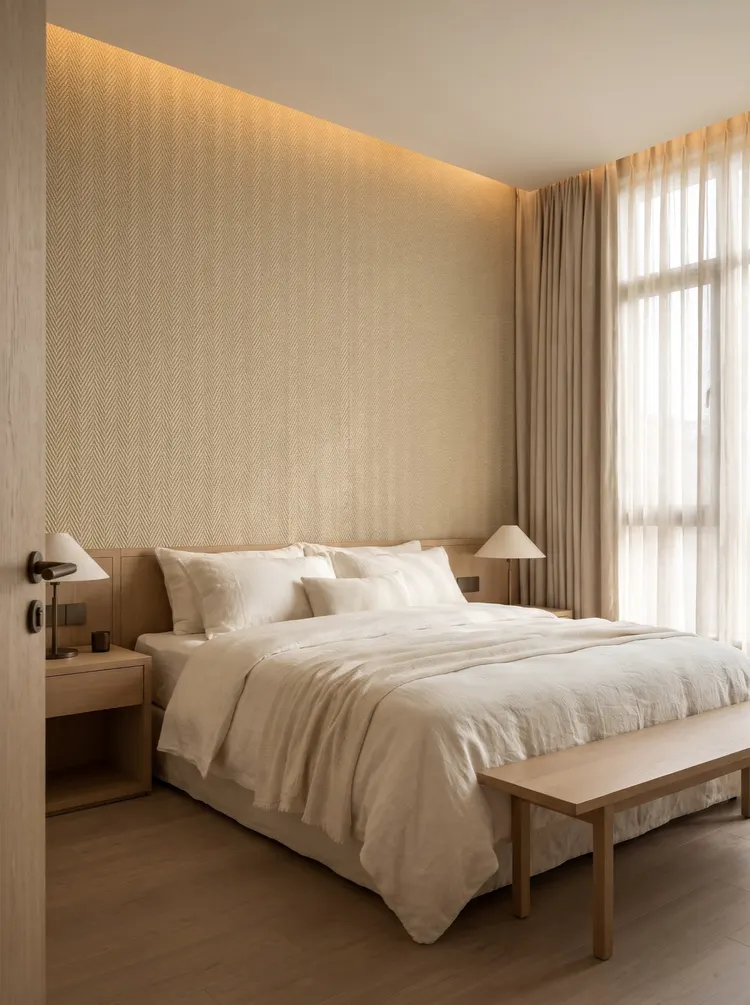
The herringbone weave texture of linen weave flexible stone reads as a layer of warm beige from afar and as fine diagonal crossings up close. It has its own pattern, so this set of schemes adds no shaping at all—a single full surface from floor to ceiling, creating layering through texture and light from the light trough.
The reason this works is its low "contrast." The weave pattern has a sense of direction but no strong light-dark contrast, so it will not create stripe pressure. If replaced with a geometric pattern with stronger contrast, a full wall up to the ceiling would feel oppressive.
Linen weave has its own issues too: using the diagonal grain over a large area in the same direction can create a slight "tilting sensation." The solution is to align the vertical seams with the weave direction, or use furniture to break up large surfaces—nightstands, wall lamps, and headboards can all divide a large wall into several sections.
Texture direction: a detail that determines success or failure
Among the three textures, fabric grain and coarse fabric grain must be horizontal; there is no room for negotiation on this point.
Why? Because horizontal texture is a hint of the "direction of gravity". Horizontal texture makes people feel stable; once turned vertical, the wall appears tall and narrow, and the corridor becomes a tunnel.
Linen weave is diagonal and can be rotated 90 degrees to become another diagonal line. This freedom is useful: on two facing walls, using a lower-left to upper-right direction on one and a lower-right to upper-left direction on the other will visually create a "closing" or "opening" effect. But do not mix directions within the same wall—mixing them creates chaos.
There is another hidden constraint on texture direction: seams. Horizontal textures require the panel seams to be parallel to the texture, and any deviation over 1 mm is visible. Diagonal textures are more forgiving, because the diagonal lines themselves are "moving," making it hard for the eye to judge whether the seams are perfectly aligned.
Joints: three textures, three layout methods
Cloth texture stone: zero tolerance for horizontal seams. Corridor with a 2.8 m floor height and 2.4 m panels, a difference of 0.4 m. The method is to install the panels vertically, leaving 0.4 m at the top for a same-color edge band hidden behind the light trough. This way the entire wall has only vertical joints and no horizontal joints. If installed horizontally, a horizontal joint would run from one end of the corridor to the other, drawing all the attention.
Coarse cloth texture: seams can be few, but they must not be slanted. Coarse cloth texture is usually used as a local feature, with a small area; generally one or two panels are enough, with only one seam, placed in an internal corner or behind furniture.
Linen weave flexible stone: seams hidden where they cannot be seen. The headboard wall is 3.6 m wide, the panel is 1.2 m, three pieces reach the edge, with two vertical seams. These two seams fall on the centerlines of the nightstands on both sides—once the cabinets are placed, they are hidden. This is the "seam hiding" logic in layout: rather than spacing seams evenly, place them where furniture will cover them. The premise is that furniture dimensions are fixed at the layout stage.
Color: beyond beige, what other options are there?
The commonly used colors for these three textures are not limited to beige, but the color-matching logic is different.
Cloth texture stoneAvailable in four colors: white, beige, gray, and black. White is the most demanding on the substrate, while gray and black are the most forgiving—dark colors can absorb wall undulations, while light colors amplify them. For long spaces such as corridors, if white is used, it is recommended to pair it with dark door frames, using contrast to draw the eye to the doors.
Coarse cloth texturethe color palette leans warm, mainly earth yellow, grayish brown, and beige gray. Its undulation is deep, and the same color code looks clearly different under different lighting; south-facing and north-facing walls will look like two different colors. Therefore, coarse linen weave is more suitable for single-sided use and not suitable for wrapping around.
Linen weave flexible stoneCurrently there are two colors: Beige and Old South Red. Beige is warm and South Red is deep; one for the headboard and one for the feature wall is a common pairing. Old South Red tends to be brick red under warm light and brown under cool light, so it is best to view it under the project's lighting before choosing.
There is a general principle for color matching: light colors reveal the substrate, dark colors reveal the light. Light-colored walls magnify every undulation of the substrate; dark-colored walls magnify the angle of every lamp.
Adhesive and application methods: construction differences among three textures
It is also full adhesive bonding, but the adhesive quantity differs for the three textures.
The surface flatness of cloth texture stone is high, and the back is also relatively regular, so adhesive can be applied with a full trowel at 0.35kg/㎡. The back of hemp weave soft stone is slightly thicker, and the woven areas require more pressure to compact, so an adhesive amount of 0.38kg/㎡ is recommended. Coarse cloth texture has the deepest relief, and the panel rigidity is slightly higher, requiring denser support points, with adhesive starting at 0.40kg/㎡.
In terms of technique, fabric-stone is most afraid of "uneven scraping"—uneven adhesive thickness will show up as dark bands on the fine horizontal grain. So use a notched trowel, scrape all the way through in one pass, and do not go back over it.
Linen weave's biggest fear is "not being pressed firmly"—the raised points of the weave push against the panel, leaving gaps in the recesses. The method is to use a roller from the center toward the edges, then press firmly once more with the palm of your hand.
Coarse cloth texture is most afraid of "edges lifting" — the relief is deep, and panel edges are most likely to come away from the wall. The method is to increase adhesive density on all four sides, then seal the edges with a bead of same-color adhesive.
These three points were all accumulated from rework. With the same adhesive and the same wall, if the texture is changed, the application method changes.
A counterexample: using linen weave across the entire corridor
I have seen a project where the corridor used woven hemp flexible stone, laid all the way through.
The result was very awkward: the diagonal woven pattern repeated continuously in the long corridor, and as people walked forward, their eyes followed the diagonal lines, making them feel dizzy at the end. This is not a problem with the material, but a problem of "the pattern being continuous in the long direction."
With the same material, if it is used only for the end-wall feature at the end of a corridor, or only for a 1.2-meter section on each side, it actually looks quite good.
This experience can be generalized:A textured pattern with a motif: the larger the area, the more cautious you should be; a texture without a motif: the larger the area, the safer.
Care: the three textures are cleaned differently
Cleaning is where it is easiest to take a one-size-fits-all approach: one cloth, wiped from top to bottom in circles.
Among the three textures, only fabric-grain stone can be wiped this way—its recesses are very shallow, and circular wiping will not push dirt in. But even for fabric grain, it is recommended to wipe horizontally along the grain direction; do not use steel wool or a high-pressure water gun.
Linen weave should be "brushed," not "wiped." The crossing points of the weave trap dust; wiping with a damp cloth only spreads the dust around. The correct method is to brush along the weave direction with a soft-bristled brush to lift the dust out, then go over it once with a dry cloth.
Coarse cloth texture is the most troublesome. The relief is deep, and once dust gets into the crevices it cannot come out; only vacuuming works. For the first cleaning after renovation, a vacuum cleaner with a soft brush head is much more effective than a cloth.
There is also a general rule: don't use alkaline cleaners. The surface of flexible stone is mineral-based, and strong alkali will damage the dense surface layer. You won't see it right after wiping, but after a few times that area will look "dull" and different from the surrounding area.
How to quickly judge which one to choose
Give a three-step judgment method that can be used on site.
Step one, measure the viewing distance. Above 3 meters (corridors, lobbies), choose fine texture; 1.5 to 3 meters (guest rooms, elevator lobbies), all three are fine; within 1.5 meters (entryways, cashier counter backgrounds), choose woven texture or coarse texture, where the details can withstand close inspection.
Step two, see whether there is a "must be seen" requirement. For entrance signs, image walls and end views, something needs to be visible from a distance, so choose coarse cloth texture or hemp weave; large-area backgrounds only need "texture," so choose cloth-grain stone.
Step three, check whether the substrate is flat. If the substrate cannot meet 2 mm, do not choose fabric-texture stone; it will show as water ripples; choose linen weave, whose diagonal texture is much more tolerant of undulation.
After the three steps are completed, it is basically decided. What remains is only the pattern and price, which is the easiest part to negotiate.
Material file
All three textures belong to the "fabric grain and woven" series of flexible stone. The thickness, bending radius, and construction method are the same; the difference is only in the surface texture.
Beige Fabric-Grain Stone SeeProduct page 163; the same series also comes in white, gray and black; for beige hemp-woven flexible stone seeProduct page 215; the same series also includes Old South Red; see the color comparison of the three textures atCloth Texture and Weave Series.
The complete solutions made with these two materials are respectively inHotel guest room floor corridor caseandHotel guest room case, each has a sheet-by-sheet comparison of six groups of spaces. Looking at the scheme before deciding colors usually saves two rounds of rework compared with deciding colors first and then looking for a scheme.
Related articles
What lights should be used with flexible stone? Color temperature, color rendering index and wall-washing light mock-ups
Why does flexible stone look like it has changed color when you change a lamp...
What to do if flexible stone gets dirty or damaged—cleaning, repair and panel replacement
How to clean flexible stone walls, and can impact damage and defects be local...
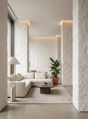
How can one white color used across six spaces avoid looking perfunctory?
A white Star Moon Stone used across six spaces in a hotel public area can eas...
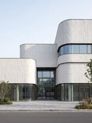
Three enemies of the white exterior wall: rain marks, alkali scaling, and seam dirt
White exterior walls look good on delivery day; the difference shows in the t...