
People who make renderings often say: a wall needs three materials to look "designed."
When it comes to actual installation, this statement turns into another question: where do the three materials meet? At that junction seam, who finishes it?
For that Singapore villa, four wall materials were used, and I looked at them one location at a time. The conclusion after looking is: the division of materials is not arranged by what looks good, but by how people walk, how hands touch, and how moisture moves.
Entryway: first distinguish grille, mirror and display niche
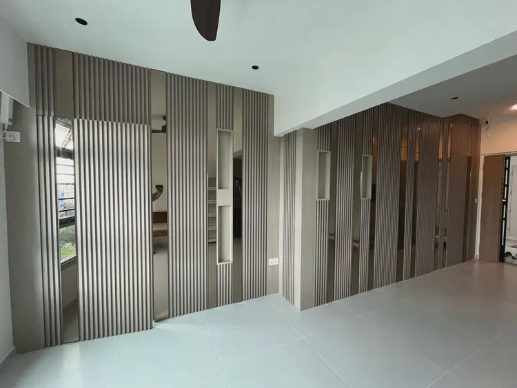
The entrance section is a foyer interface combining vertical grilles, mirror strips, and display niches. Some of the shiny vertical strips in the image are mirror reflections and should not all be understood as light-transmitting gaps leading to the living room.
Why not make just one whole wood veneer panel? Because the entrance needs layering, and also needs to accommodate display and storage. Here the interface is organized through fine vertical lines, mirror reflections and niche variations; if another project needs a truly transparent partition, the backing panel and spacing must be determined separately, and this photo cannot be used to infer that directly.
If wiring or hanging objects is needed behind the entryway, it should be arranged at the substrate stage. The grooves on the grille surface are not equipment cavities where wires can be casually stuffed, and display niches and hardware cannot be fixed only to the decorative surface. Photos can show component combinations, but concealed wiring and fixing methods still require separate drawings.
When looking at this set of material combinations, it is best to first identify the space, then the components: the TV wall is a stone-texture finished surface, the entryway is a combination of grilles and mirror, the corridor is light-colored high-gloss wall panels, and the pool image comes from another project. Each illustrates different material selection conditions, and captions should not be swapped just because the colors are similar. The bedroom color-block image is a design rendering and should also be viewed separately from the completed corridor photos.
The most error-prone part here is the finishing of the grille. The full grille reaches the ceiling, the floor, and the walls on both sides—all four edges need finishing. The top uses a same-color edge trim, the bottom lands directly on the skirting, and the two sides are sealed with narrow panels. If any one of these four edges is missed, the gap will show and be visible at a glance.
The grid spacing is also worth mentioning. Common is strip width 40 to 60 mm, gap width 20 to 30 mm. Wider gaps are more transparent but cannot block clutter behind; narrower gaps are neater but make the entryway feel stuffy. The images of this villa do not provide spacing measurements, so specific widths cannot be filled in based on them. Physical sample sections should be used to confirm the divisions of the grid, mirror strips and display niches.
Living room: full-height TV wall, requiring whole-panel vein matching
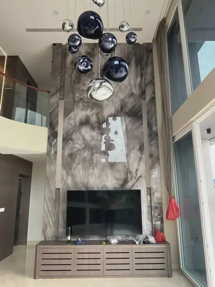
The living room is a double-height space, and the TV wall runs from floor to ceiling as a single surface. Marble wood veneer is used here.
The first issue with a full-height wall is not color, but joining. The height of a single panel is limited; for a full-height wall, the height should first be measured on site, and then the segmentation determined according to the selected panel length; this set of photos does not provide wall heights that can be measured directly. The height at which the horizontal joints of the segmentation are placed directly determines whether this wall looks good.
A common approach is to place horizontal joints above eye level so the line of sight is not interrupted by a line. A more refined approach is to align the horizontal joints with the top and bottom edges of the TV, so that the "equipment" and the "joints" appear to follow the same logic.
The second issue is texture continuity. Both stone grain and wood grain need trial layout. Whether the grain should be matched depends on the design requirements; a stone-grain feature wall cannot be treated as a wall that can be pieced together at will. If the wood grain of the upper and lower sections does not connect, the seam in the middle will look like a break. This requirement must be written clearly when placing the order: same batch number, same direction, laid in numbered sequence.
Dining room: high-gloss wall, for reflectivity
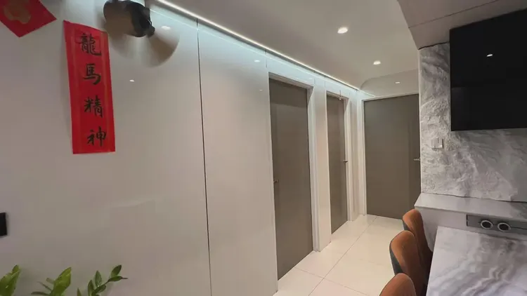
The dining room and corridor use mirror-white board wood veneer, with a slight sheen on the surface.
The reason for this choice is very practical: restaurants are usually on the inner side of a building, where natural light is weak, and some reflection is needed to bring light in. A high-gloss surface gives a soft reflection under the lights, not as sharp as a pure mirror, nor as light-absorbing as a matte finish.
The cost is that fingerprints and scratches show. Therefore, this type of material is only suitable for places people are not likely to touch—above the mid-line of the wall, behind the sideboard, and on one side of the corridor. If used where the backs of dining chairs frequently bump, it will become worn within half a year.
I have seen the opposite use on a project: high-gloss panels were installed on the wainscot on the side of a dining table, where chair backs hit every day. Three months later, the lower half of that wall was covered in fine scratches, and they could only make do with color-matched repair paste. That is "the material was not wrong, the location was wrong."
Corridor: turning the passage into a stretch of journey
Corridors are the space most easily wasted. Most projects just leave a stretch of white wall and hang two paintings.
The approach for this villa is: the corridor uses the same high-gloss wood veneer, running all the way from the dining room to the bedroom door, with no change in between. When you walk in, visually it is continuous, like a stretch of road rather than a series of doors.
There is a detail worth mentioning: corridors are usually only 1.2 to 1.5 meters wide, so the material is very close to the eyes. Viewed up close, the repetition of the texture is amplified. If a panel's texture repeat cycle is 1.2 meters, walking down the corridor you will clearly notice "there it is again." When choosing panels for corridors, pick patterns with a large range of texture variation and a long repeat cycle.
Corridor lighting is usually downlights spaced two to three meters apart. Light positions should preferably avoid panel joints; otherwise the light falls right on the joint and stretches it into a black line. This can be solved at the layout stage by changing one row of figures; changing it after installation requires removing the ceiling.
Bedroom: first review the color-blocking scheme, then decide the on-site joint layout
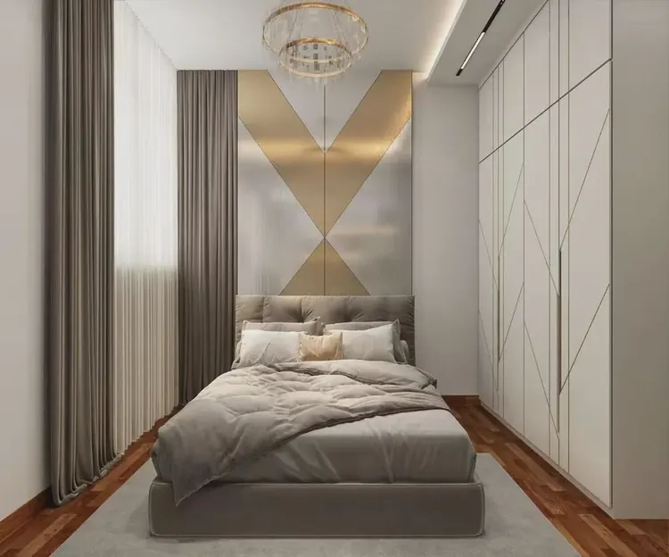
The headboard in the bedroom design rendering uses gold-silver geometric color blocking, paired with vertical texture and divided cabinet doors. This is a design scheme presentation and must not be written as a real photo of a completed vertical metal strip wall.
Color blocking is not difficult in terms of craftsmanship; the difficulty lies in the uniformity of the joints. The width of several vertical joints must be consistent; if the error exceeds 1 mm, it is visible to the naked eye. Therefore, color-blocked panels must be pre-cut at the factory and only installed on site; they cannot be cut on site.
Color blocking can change the visual rhythm, but it cannot replace substrate leveling. Both full panels and strips require a reliable, flat substrate; otherwise, undulations may still show under lighting. The scheme drawings can discuss geometric proportions, but during construction, the joint divisions, seams, and substrate acceptance must be determined separately.
Metal strips appear very restrained in this color-blocking scheme, used only as vertical dividers, less than 10 mm wide. The fixed length of this line is critical: it must run from floor to ceiling in one piece, with no joints in between. Each joint creates a slight offset, and under lighting it shows up as a black spot.
Bathroom: distinguish between renderings and actual waterproofing practices
The bathroom in this project shows a design rendering; the image shows a light-colored gold-veined wall and a dark shower partition, and is not proof that the fabric-texture wood veneer has been installed. For the bathroom application of fabric-texture wood veneer, please refer separately to the corresponding case of the Russian children's center below.
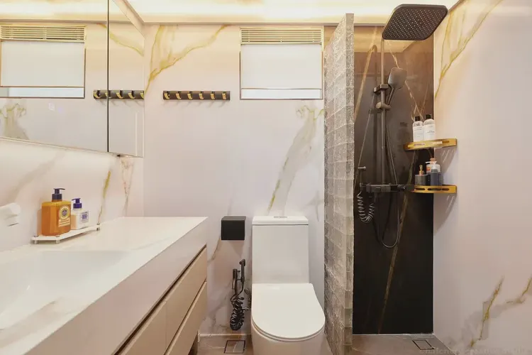
One thing must be made clear here: the "moisture resistance" and "waterproofing" of wood veneer wall panels are not the same thing. The moisture resistance of a panel depends on the specific substrate, surface layer, and edge banding, and cannot be generalized to say that all wall panels do not absorb water or swell. The finish cannot replace the waterproofing layer. Bathroom waterproofing still has to be done at the substrate; the wall panel is the finish.
What happens if the sequence is reversed? I have seen a hotel that, to save one process, applied wall panels directly onto the original wall, with waterproofing only on the floor and in the shower area. A year later, the bathroom door frame turned black; when opened up, moisture was coming up from behind the wall panels. The panels themselves were fine; what was damaged was the wall behind them.
That children's center in Russia pushed this to the limit. In the indoor children's pool, humidity is high year-round; the ceiling uses mirrored wood veneer to reflect the water surface, the two sides of the pool area use dark WPC grilles arranged vertically with gaps for ventilation, and the restroom uses fabric-textured wood veneer with gold joint lines.
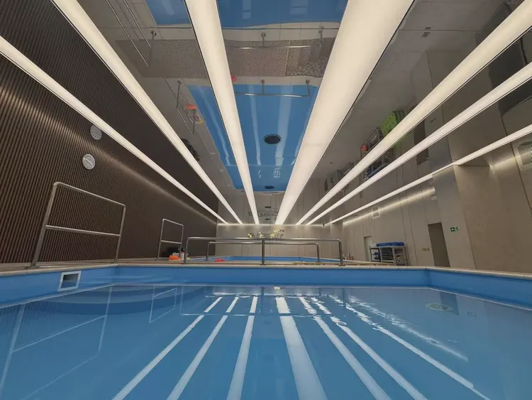
The grille there serves a "ventilation" function: gaps are left between the vertical strips so moisture does not get trapped inside the wall. This usage is also common in domestic swimming pool, hot spring and SPA projects, but many projects seal the gaps completely, and the wall ends up moldy, which then gets blamed on the material.
Five product lines, when does each one's turn come?
From the perspective of this villa, laying out the five commonly used material categories, the boundaries are actually quite clear.
| Materials | Most suitable position | Unsuitable locations | Reason |
|---|---|---|---|
| Flexible Stone | Full-height walls, curved walls, column wrapping, exterior walls | Floor, exposed terrace surface | Thin, bendable, self-weight 3–7 kg/㎡, but without impact-resistant thickness |
| PU Stone Skin | Facade, exterior wall, old wall renovation, partial shaping | Below the indoor waistline in high-frequency touch areas | Strong three-dimensional block texture, protruding blocks are easily bumped |
| wood paneling wall | Guest rooms, bedrooms, corridors, cabinet finishes | When there is no waterproofing behind the bathroom wet area | Non-absorbent but not equal to waterproof |
| WPC Grid | Entryway partition, column wrapping, ceiling modeling | Locations requiring horizontal bending | Profile direction fixing |
| Same color wall cabinet door | Positions with integrated door, cabinet and wall | Locations requiring large-format full panels | Has door types and hardware, priced per set |
The most useful column in this table is "Not suitable." When choosing materials, first clarify which locations cannot be used; that is more convenient than emphasizing which locations can be used.
When the budget is limited, where should the money go
I think the allocation logic of this villa can be copied.
Prioritize spending in three places: first, the partition that is the first thing seen upon entering, because it determines the first impression of whether it looks "expensive"; second, the seaming craftsmanship of the full-height living room wall, because if the horizontal seam position is wrong, it cannot be changed; third, the stain-resistant treatment of high-frequency touch areas, because it determines how it will look three years later.
I often tell clients one thing: every yuan you spend ends up on some seam. Where the seam is invisible, the money is wasted.
Where you can save: corridor ends, secondary bedrooms, storage rooms, the back of ceilings. Use affordable patterns from the same series in these positions; the difference is barely visible to the naked eye.
The most unwise thing to cut is the trim pieces. A house has dozens of trim locations; saving a few hundred yuan there can lead to tens of thousands of yuan in rework.
The order of arranging materials in three lines is more useful than aesthetics
After going through it once, I summarized this logic into three sentences.
First sentence:First determine how people will move. Use "light" materials in transitional areas along the circulation path (entryway, corridor) and "heavy" materials in stay areas (living room, bedroom). Grilles are light, stone is heavy, and wood veneer sits in between.
Second sentence:Then determine how it should feel to the touch. The 900mm zone below the waistline is a high-frequency contact area, where stain resistance and wear resistance take priority; above the waistline is the visual zone, where texture and gloss take priority. This line is almost an iron rule in commercial projects, but is often overlooked in home decoration.
Third sentence:Finally determine how the water will run. Spaces with water should be waterproofed first before discussing finishes; for humid spaces, prioritize methods that allow joint ventilation rather than sealing the wall completely.
The real cost of multiple materials lies at the junctions
With four types of materials, there are at least six junctions: grille and wall, grille and ceiling, wood veneer and stone, wood veneer and metal strip, high-gloss panel and matte panel, wall panel and door frame.
Every junction needs a termination piece, and someone must decide "which one overlaps which." The industry's default rule is "hard over soft, thick over thin, expensive over cheap"—stone over wood veneer, wood veneer over paint. But on site, you also have to consider the construction sequence: the party that goes first leaves a groove, and the party that goes later inserts into it.
The most effortless approach I've seen is producing a "junction detail drawing" at the design stage—drawing the six junctions as six small sections, clearly marking who goes first, how much gap to leave, and what pieces to use. This drawing isn't complex—one A3 sheet. But without it, on site it's six workers each doing their own thing in six places.
Who will press whom? This issue has caused more disputes on the scene than expected. The stone side says I am hard, you should let me press; the wood facing side says I am a finished product, and if you press me, it will leave a gap. On that day, no one is willing to make the first move, and the construction site will stop there.
My approach is to set a rule in advance:Whichever side is installed later presses against the side installed first. Why? Because later-installed items can be cut to actual dimensions, while earlier-installed items can only wait. Once this rule is stated, the arguing stops, because the sequence is pre-arranged, not a contest of face.
The cost is that the party installing later must leave an extra 5 to 10 mm of margin, increasing the amount of cutting. This loss is far cheaper than stopping work for two days.
The material itself is not difficult; the difficulty is making four materials in one house feel like one family. This does not depend on how expensive the materials are, but on whether anyone has carefully drawn a detail at the interfaces.
To see the specifications and methods for each of these four material types, you can turn towood paneling wall、WPC grid panelandFlexible Stonethree series pages; the complete record of this villa is inSingapore villa case, the children's pavilion copy is inRussian children's center case.
Related articles

How to choose white flexible stone? Star Moon Stone sampling, sealed samples and color difference control
What should be done if the color of white flexible stone samples differs from...
How much material do I need to buy for one square meter of flexible stone? How to calculate loss rate and number of pieces
How to calculate the quantity of flexible stone—should waste and reserve mate...
How to detail flexible stone exterior wall terminations? Treatment of internal and external corners, doors and windows, and eaves
How to make internal and external corners for flexible stone exterior walls, ...

How to join flexible stone on full-height walls? Lobby jointing and column layout
How should full-height walls in a hotel lobby be laid out, and where is it mo...