
In the materials business, the hardest phrase to explain is "refer to the actual product."
The client holds the rendering and says I want this white. You show him the sample under the showroom light, and he says yes, this is it. When the goods arrive at the site and the sun shines on them, he says why has it turned gray. Neither party is lying; the problem is that the sample never stood under the site light for a single minute.
That café in Jing'an, Shanghai, white Xingyue Stone, 260 square meters. Three rounds of sampling, twenty-six days in total. I recorded the whole process because it is almost the standard script for this type of problem.
First sampling: what was sent wrong was "white"
The first sample sent was a standard white sample board, a small piece of 10×10 cm.
The client replied on WeChat the same day, with just three words: "Too bright."
I was a bit surprised at the time. This white looked warm and soft under the showroom spotlights—how could it be too bright? Later I understood: they weren't looking at the showroom, they were looking at a phone. The sample sat on a café table at three in the afternoon in natural light, shot straight from an iPhone, white balance auto-shifting cool, and the whole panel looked blue on screen.
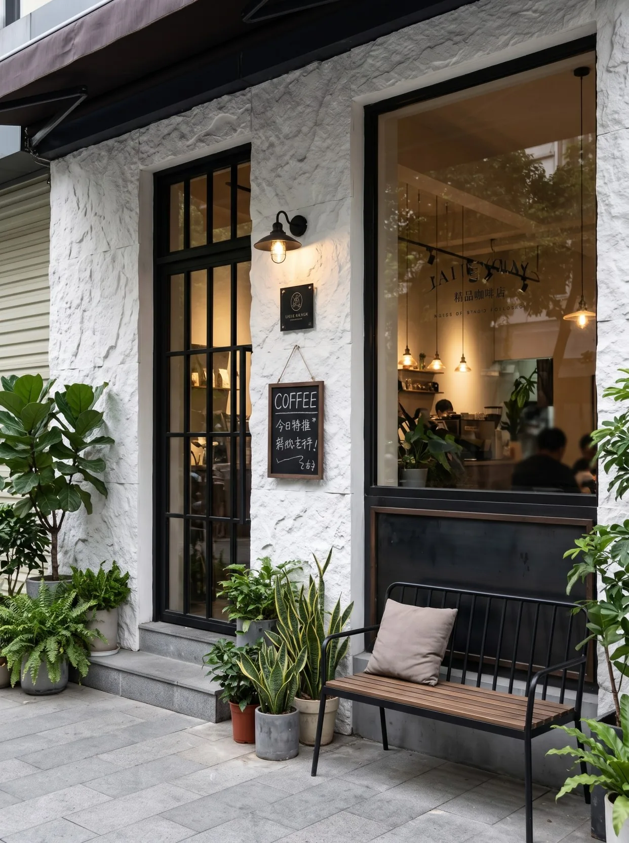
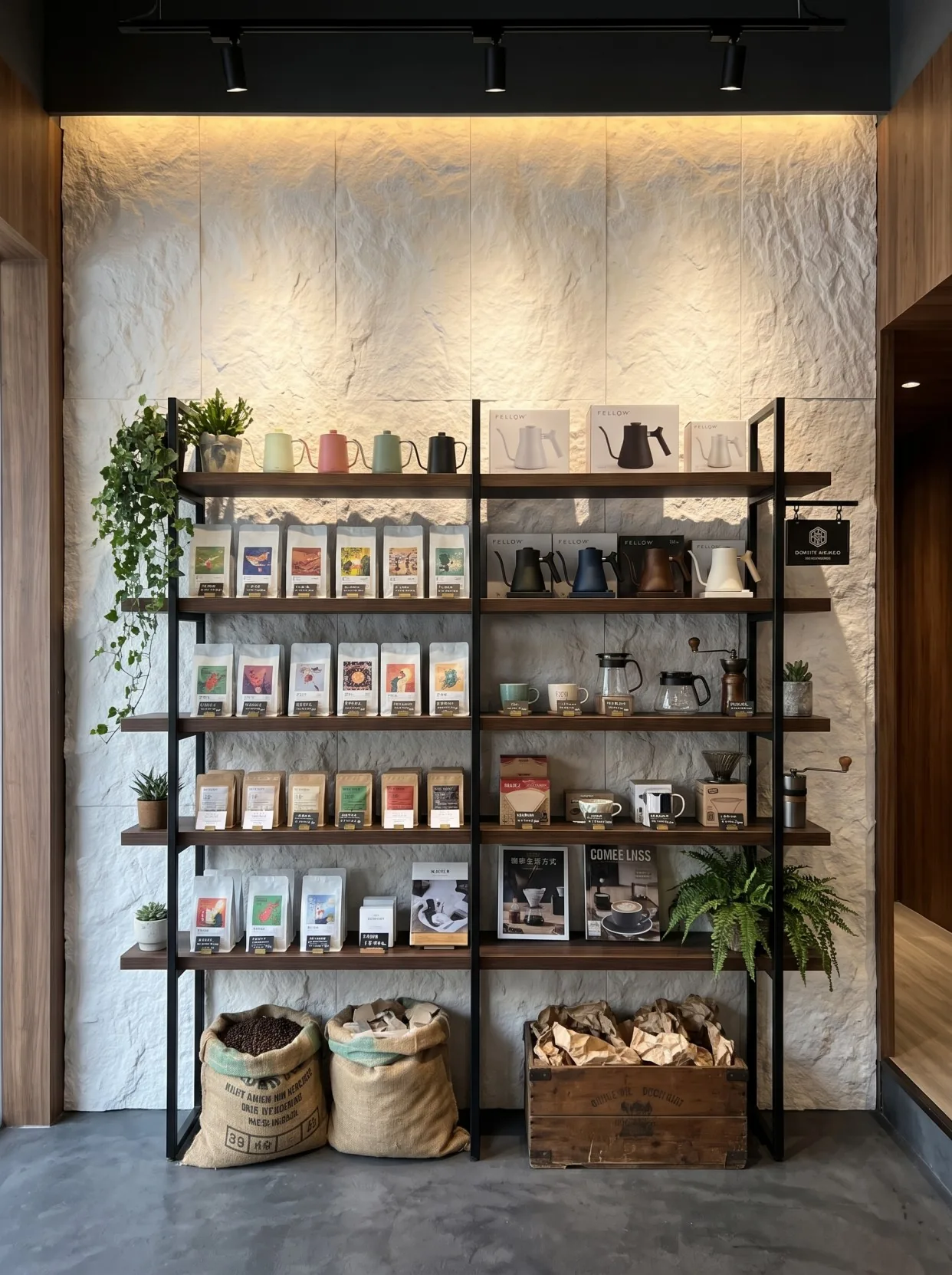
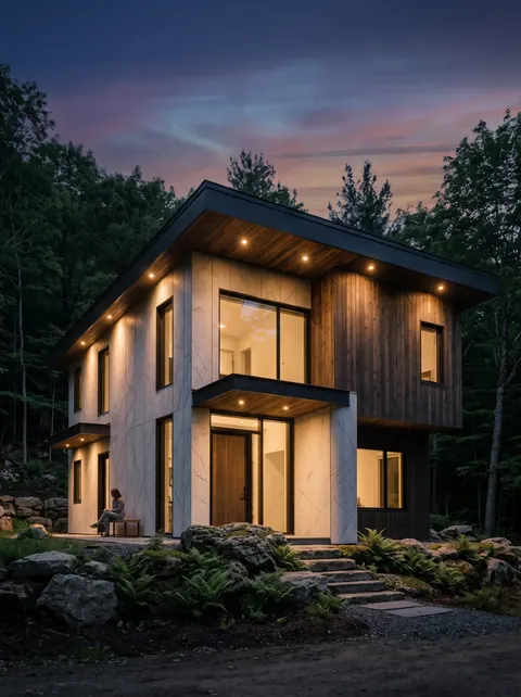
When choosing white, these images can help compare the appearance at storefronts, beside windows, and under indoor lighting, but the white on a screen must not be treated as an approved sample. Black-framed windows, dark shelving, and warm lighting all change a person's judgment of the same white wall. To truly determine the color, a large sample of the same product should still be brought to the main usage location, confirmed separately under natural light and actual luminaires, and the observation conditions recorded together with the sample number.
This matter taught me a basic judgment: viewing a small sample under the wrong conditions is worse than not viewing it at all. It creates a wrong impression, and later it takes twice the time to correct it.
Let me also explain phone photography thoroughly. Today's phones automatically do three things: adjust white balance, suppress highlights, and sharpen. These three things are good for landscape photography but are all interference when viewing materials. If you point the phone at the same white board, the phone finds no neutral reference in the frame and guesses a white balance; the guess depends on what else is in the frame—green plants make it warmer, blue sky makes it cooler.
So now I don't let clients decide color from photos—I only let them look at the real thing on site. If a photo really must be sent, I place a standard gray card next to the panel so the phone has a reference. It's a crude method, but more effective than arguing about whether the photo has a color cast.
I did two things. First, I took their color card to their store site and took a set of photos at 10 a.m., 4 p.m., and after the lights were turned on in the evening; second, I changed the samples to 20×30 cm size, because the edges of small pieces reflect light and always look brighter than large pieces.
Second sampling: the problem became "too coarse"
The second submission was a 20×30 large sample in the same color. This time the client said the color was acceptable, but the texture was "a bit coarse" and asked whether there was a finer one.
This is the characteristic of the star-moon stone category: its surface consists of granular protrusions of uneven thickness; from afar it is a clean white, and up close it has a sandy feel and fine pits. For the same material, the particle density is fixed, and only slight differences between batches can be adjusted; it cannot be adjusted to a "half as fine" effect.
I explained for a long time and couldn't get it across, so finally I did one thing: I took the sample 15 meters away and had him stand across the street to look. He paused and said he couldn't see the grain—just a sheet of white.
This is the logic of this kind of texture—it is meant for "distance." Pedestrians walking by 3 to 10 meters away see the overall white and a bit of layering; only when testing a sample board do you get within 10 centimeters. So choosing a texture is not about choosing how fine it is, but about what it looks like at your viewing distance.
Coarse texture changes light and shadow, but it does not automatically mean dirt resistance. Dust can also accumulate in the recesses, and white walls facing the street must also contend with rain streaks and fallen-leaf stains. Whether it is easy to clean needs to be tested with a small sample of the actual surface layer, and then the cleaning agents and tools should be agreed upon; a conclusion cannot be drawn merely because it looks temporarily clean in a photo.
I sent three large samples from different batches together and had them look side by side. The conclusion: at 30 cm the three were nearly identical, at 1 meter completely identical, and only at 10 cm could you tell the grain distribution differed slightly.
The client accepted it. But raised a new question: the entrance sign is outdoors—will this white resist dirt?
This problem is much more practical than color variation. Street-facing facades have exhaust, rain, and leaf sap from street trees; a white exterior wall will become stained within a year. My proposed solution is: use the same material for the storefront header section, but apply a cleanable treatment to the surface, and use a soft brush when cleaning so it can reach into the recesses.
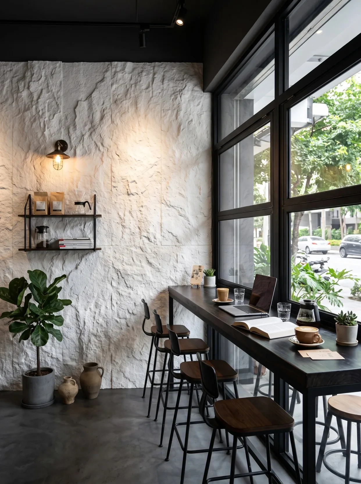
Third sampling: look under the light at the construction site
The third time was not sending samples, but bringing the sample board to the site.
That afternoon at 2:30, the old wall at the storefront position had not yet been fully removed. We stood on the sidewalk, leaned three 20×30 samples against the scaffolding, and looked at them once each at three, four, and five o'clock.
At three o'clock, the sun leans west, the panel surface leans warm, close to the off-white in the rendering. At four o'clock, the light becomes flat, and the panel surface returns to neutral white. At five o'clock, the glass curtain wall across the street begins to reflect, and the panel surface leans cool, close to the white they first saw on their phone.
The client said on the spot: "So it does change."
Yes, it will change. Any material will change under natural light. The meaning of color setting is not to find a white that never changes, but to find a white that you are satisfied with during the main viewing period.
The main business hours of this café are from afternoon to night, and the time when guests walk past from the street is concentrated in the evening. So what was finally chosen was not the whitest one, but the one that feels most comfortable between four and six o'clock.
There is another time at night. I installed two 3000K spotlights to test, and the panel surface warmed by half a color level; the client said this looks better. So what you should actually ask is: at what time is this white most often seen? The answer determines at what time you should set the color.
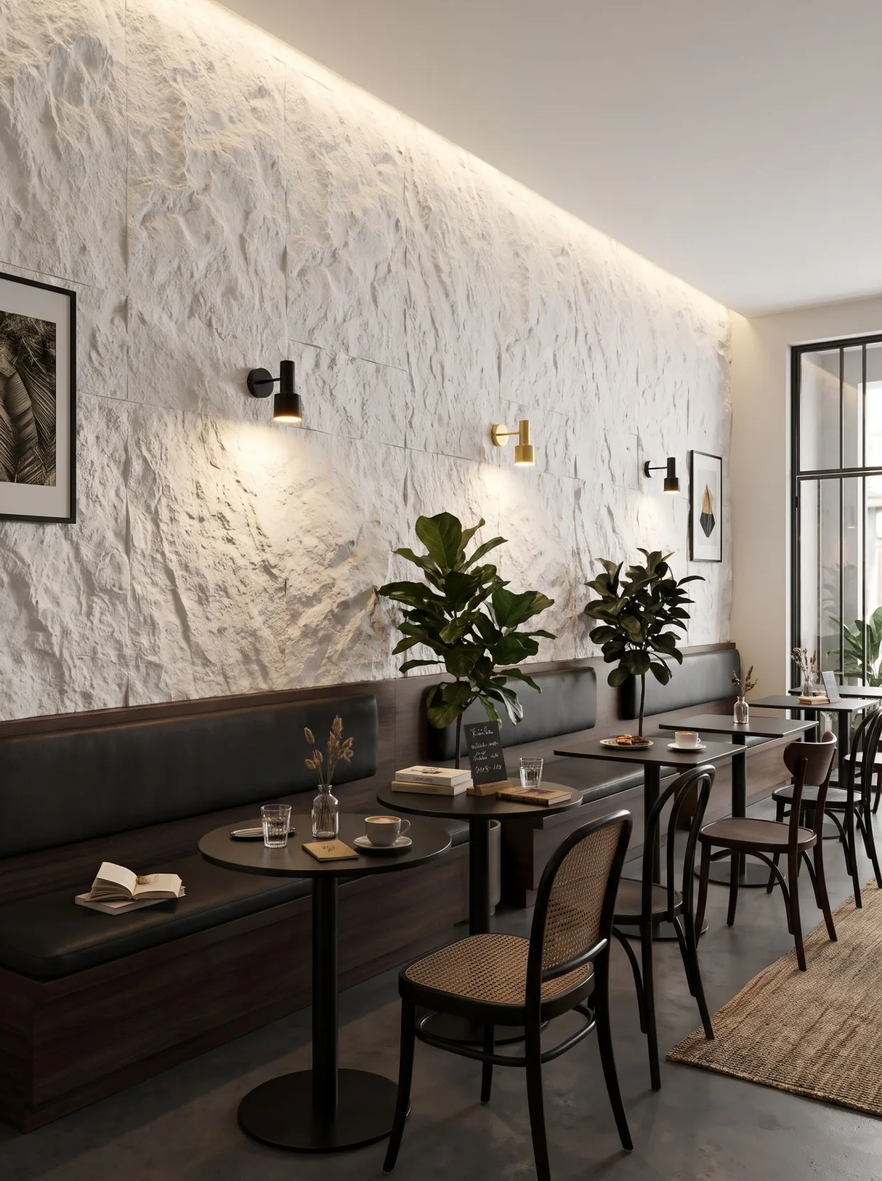
Insert a section in the middle: the project without a sealed sample
During the same period, I was also working on another project, a restaurant in Chengdu, using dark gray slate. The client looked at two samples and said it was fine, then placed the order directly without sealing a sample.
When the goods arrive at the site, problems arise. The sample is a cooler gray, while the bulk goods are warmer with a hint of brown. The construction party calls it a color difference, and the supplier says the batch is normal. Each side holds up a panel to compare, and neither can convince the other.
How was it finally solved? More than 30 square meters that had already been installed were all torn off and production was rescheduled. Why tear it off? Because that wall was installed with a mix of old and new batches, and there were two grays on the same wall; under light it looked like patches. Tearing it off and redoing it cost more than 20,000 yuan in material processing fees, and the schedule was delayed by nine days.
Looking at this together with the café project, the difference is not in the material but in how it was handled. One turned "the look we agreed on" into three signed physical samples; the other had only a line in the chat records saying "just use this gray."
I do not think sealed samples can avoid all problems. There will always be slight differences between batches, and the range within which slight differences are acceptable is inherently vague. But with a sealed sample, there is at least a reference object that can be brought out for comparison, and the argument shifts from "what you think" to "let's measure."
At the sealed sample stage, four sentences must be written in
Once the mockup is set, the next step is to turn it into something binding. We sealed three samples, with the client, construction party and supplier each holding one, signed and sealed. Four statements were written on the form:
First sentence: Color name + internal code + batch number. A name alone is not enough; under the name "White Star Moon Stone" there may be seven or eight batches.
Second sentence: describe the allowable color difference range in a verifiable way. For example, "compared with the sealed sample, no obvious difference by visual inspection under D65 light source," or more practically, "within the same batch, there must be no visually discernible difference in lightness or darkness."
Third sentence: Batch changes must be communicated in advance. This sentence is left for three years later: if replenishment is needed, the supplier can say in advance "this batch is slightly warmer," rather than waiting until the goods arrive to discover it.
Fourth sentence: color judgment conditions during acceptance. Specify under what light, at what distance, and for how long to look. It sounds ridiculous, but when something really goes wrong, these three items determine who is right.
Sealed samples are not a formality. They are the only thing that can restore "what was agreed at the beginning" six months later.
How to check this white area on site
For the contractor, the sealed sample is not just for show—it has a very specific purpose: check it first when opening the boxes.
For this batch of 83 panels for the café, entry was split into two deliveries. The first was 60 panels, and the second was 23 panels. The construction team's approach was: take two panels from each box, lean them against the wall next to the sealed sample, and look from three meters away. If there were differences, the whole box was set aside, contact was made on the spot, and they were not installed on the wall.
This action takes ten minutes every day, but it keeps problems from reaching the wall. Once a board is installed, the cost of tearing it off is more than five times the cost of installing it—the adhesive must be scraped off, the substrate repaired, and new material awaited.
One more thing to be clear about: differences between white batches are best used up during the layout stage, not left to the end. Use the same box for the same wall as much as possible, and spread any slight differences across different walls; don't let a main feature wall end up with a top half and bottom half that don't match.
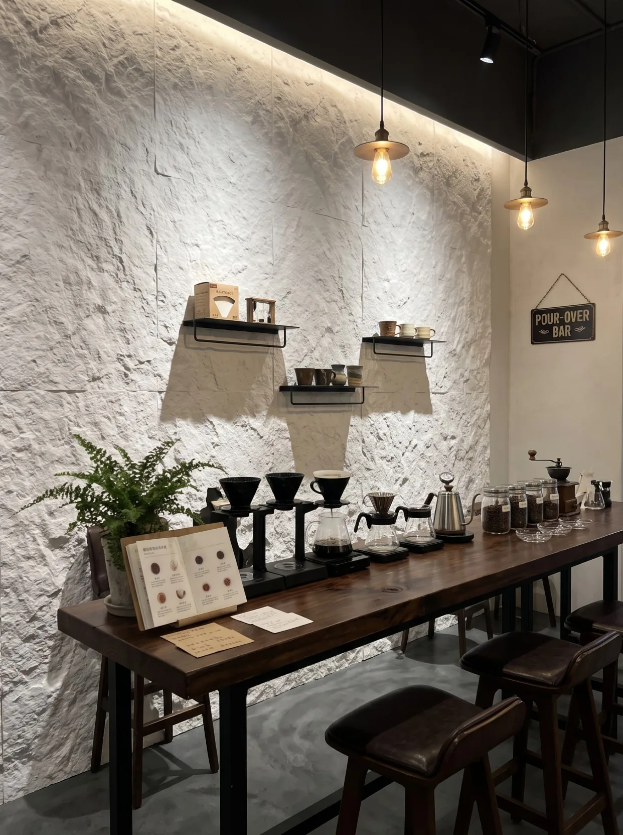
Why is white particularly difficult
Looking back, here is a saying from the industry: among all colors, white is the hardest to define.
Dark colors are more forgiving; a slight difference between dark gray and light gray is almost invisible to the naked eye. White does not work; when white and yellowish white are placed together, it looks like there is a line between them. White is also the most sensitive to light; the same panel can differ by a full shade under 2700K and 4000K lighting.
This is also why this project ultimately did not choose the "whitest" one. Pure white looks dirty under indoor warm light and glaring under outdoor sunlight. A white with a little warmth is instead stable in both environments.
If you are also choosing white, here is a rule of thumb from experience: do not compare samples in front of a white wall, as that will make the sample look yellow. Look at it against a gray wall or a wood-colored background, which is closer to reality.
Twenty-six days: is it worth it?
Some people ask whether it is too long to make three samples of one panel over twenty-six days.
My view: what those twenty-six days bought was worth more than the time saved. It bought a shared memory of the same white among three parties—the client remembers how it looked at dusk, the installer remembers it had to be viewed from the scaffold, and I remember it turns blue on a phone.
Over the eleven days of panel installation afterward, there was not a single rework due to color. During these eleven days the client came to look twice; the second time he brought a friend, stood at the entrance and said "this white is the one I picked," with a bit of pride in his tone, and listening nearby I felt quite pleased too. A panel going through three rounds is really all for that sentence.
The material itself is 1220×2930mm, 2.5–3.5mm thick, about 4.76kg/㎡, and follows JG/T 540-2017. These parameters are written in the specification sheet and anyone can check them. But "is this white the white you want" cannot be answered by a specification sheet—only by making a sample.
Later I summarized sampling in one sentence:What sampling tests is not color—it is consensus. When the client, contractor, and supplier form the same memory of the same panel, there will be no need to argue later.
If time is tight and you can only make one sample, I suggest skipping mailed samples and taking the sample directly to the site to view it for half an hour during the project's main usage period. The effect of this half hour is better than looking at a color card in a meeting room for a day.
To see the real product without filters,White star-moon stone product pageThere are 7 on-site photos from different angles in; the complete record of this project from the storefront to the bar is inShanghai Jing'an café case. When two pages are placed together, it is basically an online proofing.
Related articles
How much material do I need to buy for one square meter of flexible stone? How to calculate loss rate and number of pieces
How to calculate the quantity of flexible stone—should waste and reserve mate...
Flexible stone procurement list: how to check specifications, quotations, testing and contracts
What parameters should be clarified before purchasing flexible stone? Based o...
How to pair flexible stone, wood veneer and WPC grilles? Wall material selection guide
What wall materials are used for the entryway, TV background wall, corridor a...
How to detail flexible stone exterior wall terminations? Treatment of internal and external corners, doors and windows, and eaves
How to make internal and external corners for flexible stone exterior walls, ...